Using the UIPickerView and UIDatePicker Components in iOS 4 iPad Applications (Xcode 4)
| Previous | Table of Contents | Next |
| An iPad iOS 4 Split View and Popover Example (Xcode 4) | An iOS 4 iPad Multiple Component UIPickerView Example (Xcode 4) |
Learn SwiftUI and take your iOS Development to the Next Level |
In terms of user interface design, there is much to be gained by presenting the user with controls that are similar to physical, “real world” controls. When, for example, a user is presented with a UIButton object in the user interface of an iPad application they instinctively know that they are supposed to press it because that is what they know to do with a physical button.
Nowhere is this real world paradigm more prevalent than in the case of the iOS 4 UIKit Picker components. Both the UIPickerView and UIDatePicker provide a user friendly approach to allowing a user to review and make selections from a wide range of options. In this chapter we will talk about pickers in general before working through a simple example designed to demonstrate the basics of using the Date Picker class. The next chapter entitled An iOS 4 iPad Multiple Component UIPickerView Example will cover the UIPickerView in more detail.
The DatePicker and PickerView Components
If you have used the iPad’s built-in calendar application then the chances are very good that you have also used an instance of the UIDatePicker class. This class provides a user friendly and intuitive way for the user of an application to make date and time selections. The following figure illustrates the appearance of a typical DatePicker component implementation:
The picker is composed of multiple wheels referred to as components each of which spins independently of the others (at least by default since it is also possible to make components dependent on each another). Each item on a wheel represents an option and is referred to as a row. A row in a component is deemed to be selected when it is positioned beneath the highlighted strip. For example, the above figure shows the Feb 2 row as being selected in the far left hand component.
The UIDatePicker component is a pre-configured class designed specifically for the selection of dates and times. The UIPickerView class, on the other hand, allows for the creation of custom picker controls and will explored in An iOS 4 iPad Multiple Component UIPickerView Example.
A DatePicker Example
By way of introduction to the concept of using pickers in an iPad application we will begin with a very simple example that utilizes the UIDatePicker class. The application will consist of a DatePicker, a label and a button. When the button is pressed by the user the date and time selected in the picker will be displayed on the label.
Begin by creating a new iOS iPad application project named datePicker using the View-based Application template. Once the main Xcode project window appears, select the datePickerViewController.h file, modify it to add the outlets for the user interface objects and add a declaration for the action method to be called when the user touches the button:
#import <UIKit/UIKit.h>

@interface datePickerViewController : UIViewController {
        UIDatePicker *datePicker;
        UILabel *dateLabel;
}
@property (nonatomic, retain) IBOutlet UIDatePicker *datePicker;
@property (nonatomic, retain) IBOutlet UILabel *dateLabel;
-(IBAction) getSelection;
@end
Designing the User Interface
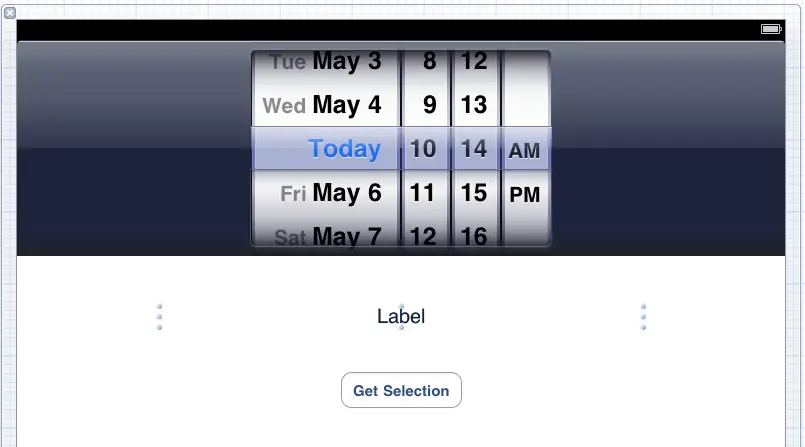
Select the datePickerViewController.xib file and drag and drop the Date Picker, Label and Button components from the Object library panel (View -> Utilities -> Object Library) onto the view and modify and position the layout so that the view resembles the following figure:
Note that the text of the label should be centered and stretched so that it wider than the default size. The configuration of the Date Picker object (such as date format etc) may be changed if desired via a variety of properties accessed by selecting the object in the view and displaying the Attributes Inspector.
Establish connections between the outlet defined in the datePickerViewController.h file and the Date Picker by Ctrl-clicking on the File’s Owner icon and dragging the resulting line to the Date Picker object in the view window. Release the pointer and select datePicker from the resulting menu. Repeat this task to connect the dateLabel outlet to the Label object.
Finally, select the button in the view window and display the Connections Inspector (View -> Utilities -> Connections Inspector). Click in the circle to the right of the Touch Up Inside event and drag the line to the File’s Owner entry. From the resulting menu, select the getSelection action method.
Coding the Date Picker Example Functionality
Now that the outlets and user interface have been implemented it is time to write the functional code that will make the application work. In actual fact, the only method that needs to be implemented for this simple example is the getSelection action method that is called when the user touches the button. In addition, the @synthesize directive for the two outlets also needs to be added. The following code fragment outlines the required changes to the datePickerViewController.m file:
#import "datePickerViewController.h"

@implementation datePickerViewController
@synthesize datePicker, dateLabel;

-(void)getSelection
{
   NSLocale *usLocale = [[[NSLocale alloc]
       initWithLocaleIdentifier:@"en_US"] autorelease];

   NSDate *pickerDate = [datePicker date];
   NSString *selectionString = [[NSString alloc]
       initWithFormat:@"%@",
       [pickerDate descriptionWithLocale:usLocale]];
   dateLabel.text = selectionString;
   [selectionString release];
}
.
.
.
@end
Learn SwiftUI and take your iOS Development to the Next Level |
Last, but by no means least, the selectionString object is released.
Releasing Memory
The final step prior to building and testing the application is to make sure any memory allocated within the view controller is released. This involves changes to the viewDidUnload and dealloc methods located in the datePickerViewController.m file:
- (void)viewDidUnload {
   // Release any retained subviews of the main view.
   // e.g. self.myOutlet = nil;
   datePicker = nil;
   dateLabel = nil;
}
- (void)dealloc {
   [dateLabel release];
   [datePicker release];
   [super dealloc];
}
Building and Running the iPad Date Picker Application
Once the application project work is complete, click on the Run button located in the toolbar of the Xcode main project window: <google>ADSDAQBOX_FLOW</google>
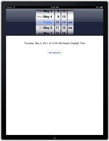
Once the application appears inside the iOS iPad Simulator, select a date and time using the picker and then touch the Get Selection button. The label will update to reflect the selected date and time as shown in the previous figure.
Learn SwiftUI and take your iOS Development to the Next Level |
| Previous | Table of Contents | Next |
| An iPad iOS 4 Split View and Popover Example (Xcode 4) | An iOS 4 iPad Multiple Component UIPickerView Example (Xcode 4) |


