Using Size Classes to Design Universal iOS User Interfaces
| Previous | Table of Contents | Next |
| Understanding the iOS 8 Auto Layout Visual Format Language in Swift | Using Storyboards in Xcode 6 |
Learn SwiftUI and take your iOS Development to the Next Level |
In 2007 developers only had to design user interfaces for a single screen size and resolution (that of the first generation iPhone). Taking into consideration the range of iOS devices, screen sizes and resolutions available today, the task of designing a single user interface layout to target the full range of device configurations now seems a much more daunting task.
Although eased to some degree by the introduction of Auto Layout, designing a user interface layout that would work on both iPhone and iPad device families (otherwise known as a universal interface) typically involved the creation and maintenance of two storyboard files, one for each device type.
iOS 8 and Xcode 6 have introduced a new concept in user interface design referred to as size classes intended specifically to allow a user interface layout for multiple screen sizes and orientations to be designed within a single storyboard file. In this chapter of iOS 8 App Development Essentials, the concept of size classes will be covered together with a sample application that demonstrates how to use them to create a universal user interface.
Understanding Size Classes
Size classes categorize the various screen areas that an application user interface is likely to encounter during execution. Rather than represent specific screen dimensions and orientations, size classes represent width and height in terms of being compact or regular.
An iPhone display in portrait orientation, for example, is represented by the regular height and compact width size class. The same device in landscape, on the other hand, is considered to be of compact height and regular width.
In terms of size class categorization, the iPad family of devices is considered to be of regular height and regular width in both portrait and landscape orientation.
Size Classes in Interface Builder
Interface Builder in Xcode 6 allows different Auto Layout constraints to be configured for different size class settings within a single storyboard file. In other words, size classes allow a single user interface file to store multiple sets of layout data, with each data set targeting a particular size class. At runtime, the application will use the layout data set for the size class that matches the device and prevailing orientation on which it is executing, ensuring that the user interface appears correctly.
Any Auto Layout constraints that are assigned while Interface Builder is in regular height, compact width mode, for example, will only be applied to the views in the user interface when the app encounters such an environment that matches the size class (in this case an iPhone device in portrait orientation).
Similarly, switching Interface Builder to a different size class mode (such as regular height and width) within the same storyboard file will allow entirely different Auto Layout constraints to be defined within the same layout storyboard file which will take effect only when the app is running on an iPad.
Customizing a user interface for different size classes goes beyond the ability to configure different Auto Layout constraints for different size classes. Size classes may also be used to designate which views in a layout are visible within each class, and also which version of a particular image is displayed to the user. A smaller image may be used when an app is running on an iPhone, for example, or extra buttons might be made to appear to take advantage of the larger iPad screen.
Setting “Any” Defaults
When designing user interfaces using size classes, there will often be situations where particular Auto Layout constraints or view settings will be appropriate for all size classes. Rather than having to configure these same settings for each size class, these can, instead be configured within the Any category. Settings configured with Interface Builder in Any mode will be picked up by default by all other size classes unless specifically overridden within those classes.
In fact, the recommended approach to designing universal user interfaces using Interface Builder is to begin by designing for a particular target device (for example the iPad) with all of the settings applied to the Any category. Once the layout is complete, any exceptions should then be specified in the other size classes. Using this approach, it is only necessary to override those settings that need to change to meet the requirements of the other size classes. Essentially, the Any settings can be thought of as the base values which apply to all size classes.
Working with Size Classes in Interface Builder
Size classes are an optional feature within Interface Builder and can be turned on and off on a per storyboard file basis. Whether or not a storyboard file has size classes enabled can be verified by loading the file into the Interface Builder environment and displaying the File Inspector in the Utilities panel. Figure 24-1, for example, shows the size class and Auto Layout settings for a storyboard file:
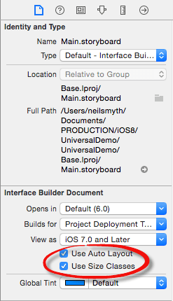
Figure 24-1
When a storyboard file has size classes enabled, an extra option appears along the bottom edge of the Interface Builder file indicating the currently selected size class. Figure 24-2, for example, shows that size classes are enabled for the current storyboard file and that the Any category is selected for both height and width size classes:
Figure 24-2
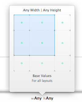
Clicking on the size class setting in the status bar will display the panel shown in Figure 24 3. This panel displays a grid with each cell representing a width and height size class combination. This grid serves to provide a visual representation of the current size class selection whilst also providing a mechanism for selecting a different size class. In the case of Figure 24-3, the Any Width and Any Height classes are selected. Consequently, any layout settings performed in the storyboard canvas in this mode will be used in all other size class configurations unless specifically overridden.
Figure 24-3
When in Any mode, the layout canvas for the view controllers in the storyboard are sized at 480 x 480 to indicate that layout settings configured in this mode are not specific to any particular size class.
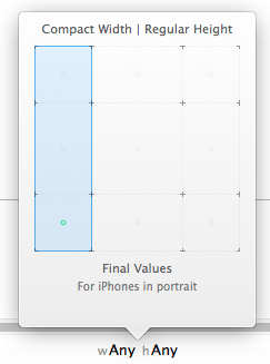
As the mouse pointer is moved over the size class selection grid, the blue area will change to reflect different size classes. Hovering the mouse pointer over the bottom left hand square within the grid (Figure 24-4), for example, displays the traits of the corresponding size class and provides the opportunity to change to the Compact Width and Regular Height size class.
Figure 24-4
Clicking within the grid location will make this size class the active class and the view controller layout canvas in the storyboard will change size to represent an iPhone screen in portrait orientation. Once a size class has been selected, layout changes made to the storyboard will apply only to that class. Note also that the size class indicator now changes to “wCompact hRegular” (Figure 24-5), reflecting the currently selected size class. It is also worth noting that the status bar has changed to a blue background. This is intended as a subtle reminder that the layout is no longer in the “wAny hAny” mode and that layout changes will not apply to all size classes.
Figure 24-5
A Universal User Interface Tutorial
The remainder of this chapter will work through the creation of a universal layout example.
Create a new Xcode Single View Application project named UniversalDemo with the language option set to Swift and the Devices menu set to Universal. Once the project has been created, select the Main.storyboard file, display the File Inspector in the Utilities panel and make sure that both the Use Auto Layout and Use Size Classes options are enabled.
Designing the iPad Layout
The iPad layout will serve as the base configuration for the user interface, so begin by making sure that the size class settings for Interface Builder are currently set to “wAny hAny”.
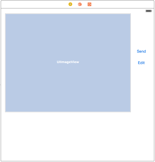
Add an ImageView and two Buttons to the view controller layout so that the user interface layout resembles that of Figure 24 6. Edit the text on the button views to read “Send” and “Edit” respectively:
Figure 24-6
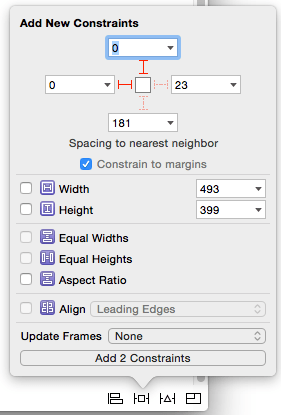
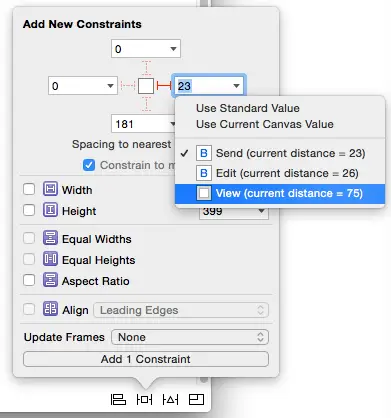
Select the Image View instance in the layout and use the Pin menu to set constraints on the top and left edges of the view of 0 with the Constrain to margins option enabled as shown in Figure 24-7 and click on the Add 2 Constraints button:
Figure 24-7
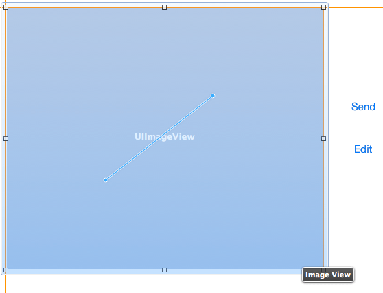
Ctrl-click and drag diagonally across the Image View as shown in Figure 24 8. On releasing the line, select Aspect Ratio from the resulting menu.
Figure 24-8
Learn SwiftUI and take your iOS Development to the Next Level |
Figure 24-9
With the Image View still selected, Shift-click on the Edit button so that both views are selected. Display the Auto Layout Align menu, enable the Vertical Centers constraint option and add the constraint.
Select just the Edit button and, using the Pin menu, configure spacing to nearest neighbor constraints for both the trailing and leading edges of the view with the Constrain to margins option disabled.
Finally, select the Send button, display the Pin menu and configure leading, trailing and bottom spacing to nearest neighbor constraints using the current values with the Constrain to margins option disabled.
Use the size classes menu to change the current size class to “wRegular hRegular” and verify that the layout appears correctly. Return to “wAny hAny” and make any necessary adjustments.
Be sure to return the size classes setting to “wAny hAny” before proceeding with the tutorial.
Adding Universal Image Assets
The next step in the tutorial is to add some image assets to the project. The images can be found in the universal_images directory of the code samples download which can be obtained from:
http://www.ebookfrenzy.com/direct/ios8/
Within the project navigator panel, locate and click on the Images.xcassets entry and, once loaded, select the Editor -> New Image Set menu option. Double click on the new image set which will have been named Image and rename it to Sunset.
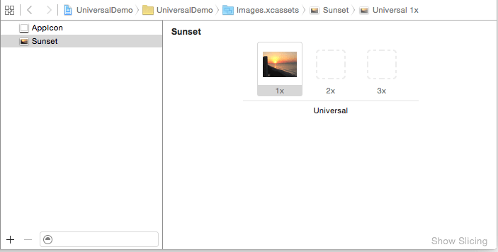
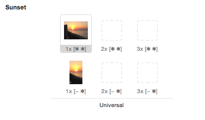
Locate the sunset_wAny_hAny.png file in a Finder window and drag and drop it onto the 1x image box as illustrated in Figure 24-10:
Figure 24-10
Return to the Main.storyboard file, select the Image View and display the Attributes Inspector panel. Click on the down arrow at the right of the Image field and select Sunset from the resulting menu. The Image View in the view controller canvas will update to display the sunset image from the asset catalog.
Perform a test run of the app on a physical iPad device or iPad simulator and verify that the user interface matches that designed in Interface Builder.
Designing the iPhone Layout
Use the size classes menu to switch Interface Builder into “Wcompact hRegular” mode so that the view controller canvas changes to represent the size proportions for the iPhone device family in portrait mode.
The iPhone layout in this example will differ from the iPad layout in a number of ways. In the first instance the Edit button will be absent from the iPhone layout. To achieve this, select the Edit button, display the Attributes Inspector and scroll down to the last attribute setting which consists of a check box labelled Installed.
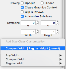
Click on the + button to the left of the installed check box and, from the resulting menu, select the Compact Width | Regular Height (current) menu option (Figure 24-11):
Figure 24-11
An option will now be available to control whether or not the selected view is installed in the current size class. To uninstall the view, uncheck the “wC hR” option as shown in Figure 24 12. Once the option has been disabled, the Edit button will no longer be present in the current size class. Temporarily switch back to “wAny hAny” mode and verify that the button will still be visible on the iPad before switching back to the “wCompact hRegular” size class.
Figure 24-12
Adding a Size Class Specific Image File
The iPhone portrait variant of the user interface layout is going to use an image file that is more appropriate to the size of the screen. Once again, select Images.xcassets from the project navigator panel and, with the Sunset image set selected, display the Attributes Inspector and change the Width attribute to Any & Compact. Within the Sunset image set, an additional row of image options will appear. Once again, locate the images in the sample source code download, this time dragging and dropping the sunset_wCompact_hRegular.png file onto the 1x image well in the compact row as shown in Figure 24-13:
Figure 24-13
Return to the storyboard file and note that the new image is now displayed on the current size class (the “wAny hAny” class will continue to display the previous image).
Shift-click on both the Image View and Send button and select Clear Constraints from the Auto Layout Resolve Auto Layout Issues menu. Display the Resolve Auto Layout Issues menu a second time, this time choosing the Update Frames menu option.
Within the view controller layout canvas, re-design the layout to match that of Figure 24-14 below:
Figure 24-14
Select the Image View, display the Pin menu and set spacing to nearest neighbor constraints with the Constrain to margins option enabled as follows:
- Top – 0
- Left – 0
- Right – 0
- Bottom – Select drop down menu and choose Bottom Layout Guide, using the current value
Click on the Add 4 Constraints button to commit the changes to the layout.
Select the Send button and, using the Align menu, select and apply a Horizontal Center in Container constraint. Using the Pin menu, set a top edge spacing to nearest neighbor constraint using the currently displayed value.
Select the view controller background, display the Attributes Inspector and change the background color to Black Color.
Removing Redundant Constraints
In a previous step, the Edit button was uninstalled from the “wCompact hRegular” size class for the storyboard layout. When the view was uninstalled, however, a number of constraints that referenced the view were left in place. This may result in warnings when the app is compiled and run. As the final task before testing the app, these constraints will need to be uninstalled for the current size class.
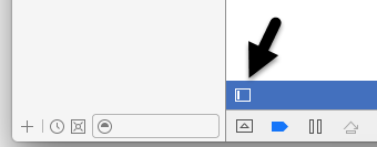
If it is not already displayed, show the Xcode Document Outline panel by clicking on the button indicated by the arrow in Figure 24-15:
Figure 24-15
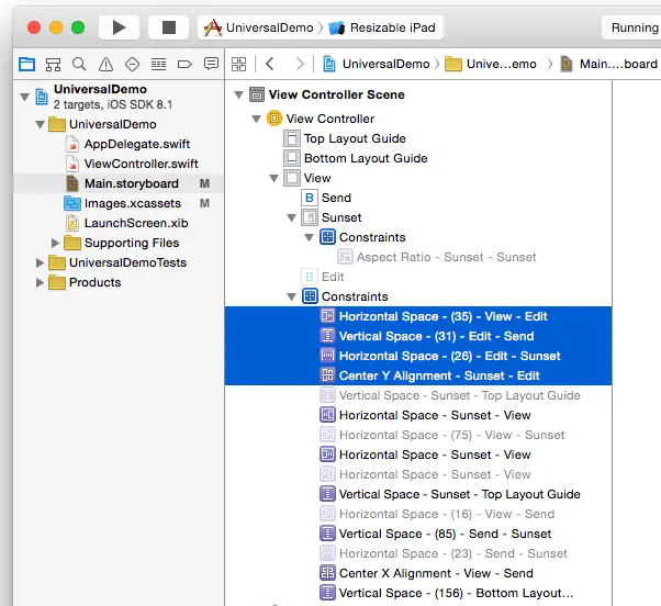
Within the Document Outline, unfold the section entitled Constraints located under the entry for the Edit button and Shift-click on the constraints that refer to the Edit button:
Figure 24-16
Display the Attributes Inspector and click on the + button to the left of the Installed setting and, from the menu, select Compact Width | Regular Height (current). A new option will appear labelled “wC hR”. Turn off the check box for this size class. Note that the selected constraints in the document outline panel are now grayed out. This indicates that the constraints still exist for other size classes but are uninstalled in the current size class.
Previewing Layouts
A storyboard layout can be previewed in a variety of device configurations using the Xcode preview tool. To preview the current layout, display the Assistant Editor panel either using the View -> Assistant Editor -> Show Assistant Editor menu option, or by clicking on the Xcode toolbar button showing the image of interlocking circles.
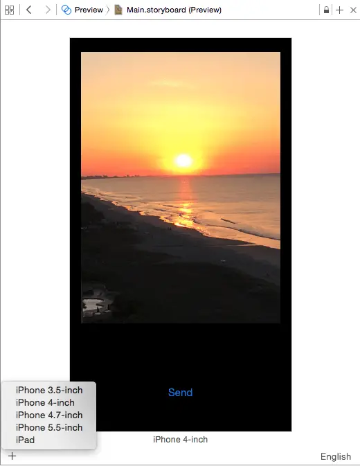
From within the Assistant Editor panel, click on the entry in the navigation bar along the top of the panel (this will currently display either Automatic or Manual). From the resulting menu, select the Preview (1) -> Main.storyboard (Preview) option. The editor will subsequently change to display a preview of the user interface as it will appear on a 4-inch iPhone device.
To preview on other device formats, click on the + button in the bottom left hand corner of the Assistant Editor panel and select a different device from the list as shown in Figure 24-17:
Figure 24-17
To remove a preview from the Assistant Editor simply select it and tap the keyboard delete key.
Testing the Application
For all of the convenience of the preview panel, there is no substitute for testing a layout running on either a physical device or an iOS Simulator session. Perform test runs of the application on different device families and note that, depending on the target device and orientation, the appropriate layout is adopted. When running on an iPhone it is also worth noting that rotating the device into landscape mode causes the app to display the “wAny hAny” layout since the iPhone layout was, of course, targeted only at iPhone devices in portrait orientation.
Summary
The range of iOS device screen sizes and resolutions is much more diverse that it was when the original iPhone was introduced in 2007. Today, developers need to be able to target an increasingly wide range of display sizes when designing user interface layouts for iOS applications. Prior to the release of iOS 8 and Xcode 6, it was often necessary to design a separate storyboard layout for each device category. With the introduction of size classes, it is now possible to target all screen sizes, resolutions and orientations from within a single storyboard. This chapter has outlined the basics of size classes and worked through a simple example user interface layout designed for both the iPad and iPhone device families.
Learn SwiftUI and take your iOS Development to the Next Level |
| Previous | Table of Contents | Next |
| Understanding the iOS 8 Auto Layout Visual Format Language in Swift | Using Storyboards in Xcode 6 |
