Supporting Different Apple Watch Display Sizes
| Previous | Table of Contents | Next |
| A WatchKit App Custom Font Tutorial | A WatchKit Map Tutorial |
| Purchase the fully updated watchOS 2/Swift 2 edition of this book in eBook ($12.99) or Print ($27.99) format watchOS 2 App Development Essentials Print and eBook (ePub/PDF/Kindle) editions contain 35 chapters. |
The Apple Watch family currently consists of two sizes of device in the form of 38mm and 42mm models. Although the difference in screen sizes between the two models is a mere 4mm, this is sufficient difference that a scene layout that fits perfectly on a 42mm Apple Watch may not fit on the 38mm model. It will frequently be necessary, therefore, to have different user interface layout attributes for each Apple Watch model. In addition to handling different screen sizes, a WatchKit app may also optionally display text using the user’s preferred font size setting.
Fortunately both the WatchKit framework and Interface Builder tool make it relatively easy to adapt scene layouts to accommodate different screen sizes and font preference settings.
Screen Size Customization Attributes
Attributes are set on user interface objects within Interface Builder by selecting the object in the storyboard scene and making changes in the Attributes Inspector panel. By default, attributes set in this way are applied to the scene when running on both sizes of Apple Watch. While designing WatchKit app scenes it is quite common, however, to need to specify a different attribute value for the 38mm screen than for the 42mm screen. Fortunately, the Attributes Inspector panel provides a mechanism for configuring screen size customization attributes. These are attributes that will be applied to the selected interface object only when the app is run on a specific screen size.
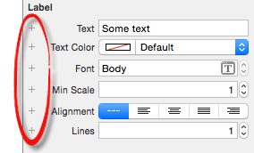
Attributes that are eligible to have screen size customization values configured appear within the Attributes Inspector panel with a small “+” button positioned in the left margin as highlighted in Figure 25-1:
Figure 25-1
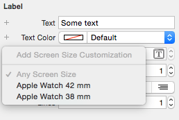
When clicked, these buttons display a menu (Figure 25-2) allowing a screen size to be selected:
Figure 25-2
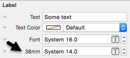
Once a screen size customization attribute has been added to an interface object it appears as an additional option within the Attributes Inspector panel. Figure 25 3, for example, shows a font setting customization attribute that configures a label object to use a smaller font size when the app runs on a 38mm Apple Watch:
Figure 25-3
The general rule with customization attributes is that the default setting is applied on all screen sizes unless specifically overridden by a customization attribute. In the above figure, for example, the label will display text using the 16pt system font on the 42mm watch model. When running on the smaller 38mm watch model, however, the 14pt customization font attribute will be used. It is worth noting that it is not necessary to also add a customization attribute for the 42mm font setting since this is covered by the default value.
Working with Screen Sizes in Interface Builder
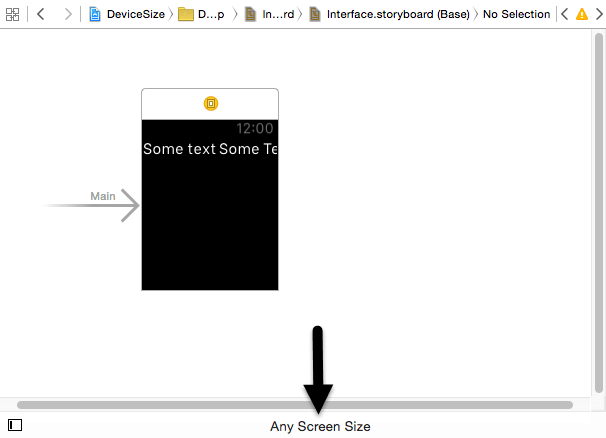
By default, the storyboard editor in Interface Builder displays storyboard scenes in Any Screen Size mode. When in this mode, interface objects are displayed using the default attributes. To see how the scenes within a storyboard will appear on different screen sizes, this mode can be changed using the selection at the bottom of the storyboard editor panel as shown in Figure 25 4:
Figure 25-4
Clicking on the button displays a menu of screen size options which, when selected, change the mode of the storyboard canvas to match the chosen screen size.
When a specific screen size mode is selected in Interface Builder the scenes in the canvas will update to reflect the size of the screen. In addition, the interface objects within the scenes will change to reflect any customization attributes that have been set for the selected screen size. This allows you to review the user interface layout as it will appear when running on the designated Apple Watch model.
A more significant point to note about changing the storyboard screen size mode is that any changes made to the scene layout will apply only for the current screen size. Consider, for example, a scene containing a label. If the storyboard editor is in 38mm mode when the text of the label is changed within the scene then that change only applies to the layout when the app is running on a 38mm device. In other words, visually manipulating the objects and layout when the storyboard editor is set for a specific screen size essentially configures screen size customization attributes which also appear within the Attributes Inspector panel.
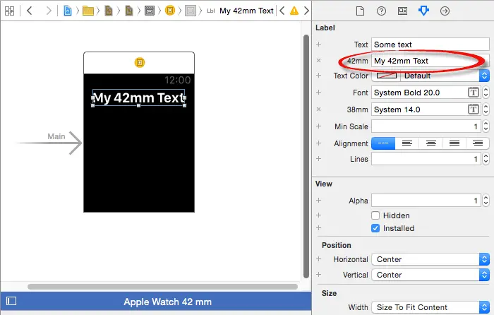
In Figure 25-5, for example, the text displayed on a label has been changed to read “My 42mm Text” from within the scene canvas while the storyboard editor is in 42mm mode. Note that as a result of this change a matching 42mm screen size customization attribute for the text property is now listed in the Attributes Inspector panel:
Figure 25-5
| Purchase the fully updated watchOS 2/Swift 2 edition of this book in eBook ($12.99) or Print ($27.99) format watchOS 2 App Development Essentials Print and eBook (ePub/PDF/Kindle) editions contain 35 chapters. |
When the storyboard editor is in any mode other than Any Screen Size, the toolbar at the bottom of the canvas is displayed in blue. This is intended as a subtle reminder that any changes made in this mode will apply only to the currently selected screen size. This includes the addition and deletion of interface objects from the canvas.
As a general rule, screen size customization attributes should be used only when a default setting will not work for both screen sizes. A useful approach is to choose a screen size as the baseline for the layout (for example the 42mm size) and design the user interface using default attributes. The layout can then be adapted for the smaller screen size by overriding the default settings only where necessary for the 38mm screen.
Apple also recommends changing the layout as little as possible between screen sizes to ensure a consistent look to the app on different devices. Drastic alterations that significantly change the appearance of the app user interface from one screen size to another should be avoided.
Identifying the Screen Size at Runtime
When developing WatchKit apps it is often necessary to make dynamic changes to the interface objects in a scene at runtime. Clearly such changes need to take into consideration the size of the screen on which the app is currently running. This can be achieved using the WKInterfaceDevice class. This class provides interface controllers with access to information about the watch device such as the size of the screen.
The first step in obtaining the current screen size is to get a reference to the current device object as follows:
let sharedDevice = WKInterfaceDevice.currentDevice()
Once a reference to the shared device object has been obtained the screen bounds property can be accessed:
let bounds = device.screenBounds
The bounds property is stored as a CGRect value from which the height and width dimensions of the screen can be accessed:
let height = bounds.height
let width = bounds.width
The screen dimension of the two Apple Watch models are as follows:
- Apple Watch 38mm – Height: 170 / Width: 136
- Apple Watch 42mm – Height: 195 / Width: 156
Summary
Although limited to two display sizes, steps will often still need to be taken to customize aspects of a scene layout to accommodate both the 38mm and 42mm Apple Watch models. This chapter has outlined the features of Interface Builder that are designed specifically for the purpose of creating scene layouts that adapt to the display size of the device on which the app is running.
| Purchase the fully updated watchOS 2/Swift 2 edition of this book in eBook ($12.99) or Print ($27.99) format watchOS 2 App Development Essentials Print and eBook (ePub/PDF/Kindle) editions contain 35 chapters. |
| Previous | Table of Contents | Next |
| A WatchKit App Custom Font Tutorial | A WatchKit Map Tutorial |
