An iOS 9 Stack View Tutorial
| Previous | Table of Contents | Next |
| Working with the iOS 10 Stack View Class | Working with Directories in Swift on iOS 10 |
Learn SwiftUI and take your iOS Development to the Next Level |
The previous chapter covered a considerable amount of detail relating to the UIStackView class. This chapter will create an iOS 10 app project that makes use of a wide range of features of both the UIStackView class and the Interface Builder tool. At the end of this tutorial, topics such as stack view nesting, adding and removing subviews both within Interface Builder and in code and the use of Auto Layout constraints to influence stack view layout behavior will have been covered.
About the Stack View Example App
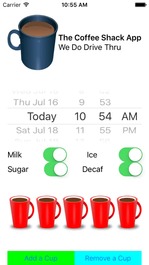
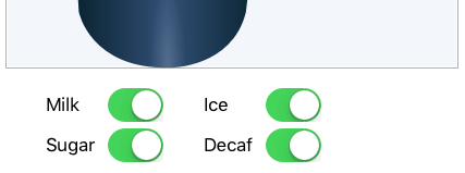
The app created in this chapter is intended as an example of many of the ways in which the UIStackView class can be used to design a user interface. The example is going to consist of a single scene (Figure 32-1) containing multiple stack view instances that combine to create the screen for a coffee ordering app.
Figure 32-1
Creating the First Stack View
Create a new Xcode iOS project based on the Single View Application template and named StackViewDemo.
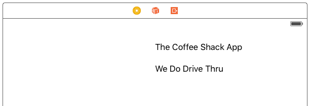
The first stack view to create within the user interface layout is a vertical stack view containing two labels. Select the Main.storyboard file from the Project Navigator panel and click on the current View as: device setting in the bottom left-hand corner of the canvas to display the device configuration bar. Select an iPad configuration from the bar (the layout will still work on iPhone size screens but the iPad setting provides more room in the scene when designing the layout). Drag and drop two Labels from the Object Library panel onto the storyboard canvas and edit the text on each label so that the layout resembles that shown in Figure 32-2:
Figure 32-2
Learn SwiftUI and take your iOS Development to the Next Level |
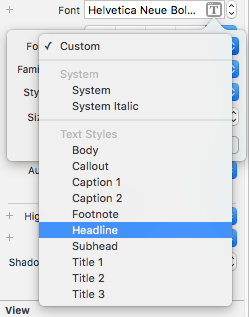
Figure 32-3
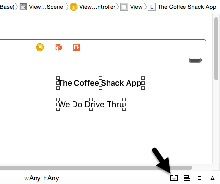
Finally, Shift-click on both of the labels and add them to a vertical stack view using the Stack button located in the lower right hand corner of the storyboard canvas as highlighted in Figure 32-4:
Figure 32-4
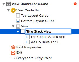
Once the button has been clicked, the two labels will be contained within a vertical stack view. Display the Document Outline panel, locate the newly inserted stack view from the hierarchy and select it, click on it a second time to enter editing mode and change the name to “Title Stack View”. Naming stack views in this way makes it easier to understand the layout of the user interface as additional stack views are added to the design:
Figure 32-5
Creating the Banner Stack View
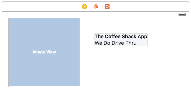
The top section of the storyboard scene is going to consist of a banner containing an image of a coffee cup and the Title Stack View created above. Begin by dragging and dropping an Image View object onto the scene and positioning and resizing it so that it resembles the layout in Figure 32-6:
Figure 32-6
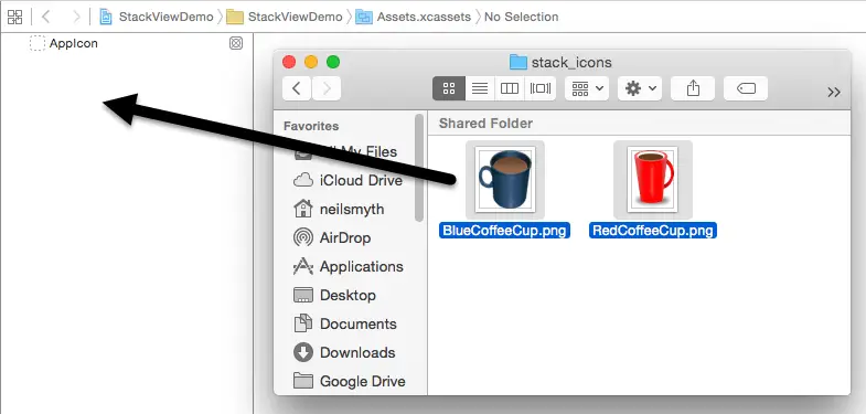
Learn SwiftUI and take your iOS Development to the Next Level |
Figure 32-7
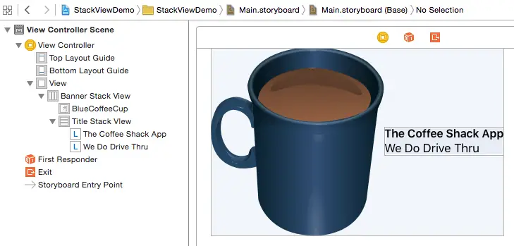
Display the Main.storyboard file once again, select the image view and use the Image property menu to select the BlueCoffeeCup image. Once selected the image should appear within the storyboard scene.
Shift-click on both the Image View object and the Title Stack View objects in the scene so that both are selected and click the Stack button once again to add both to a new horizontal stack view instance. Locate the new stack view in the Document Outline panel, select it and click on it a second time. Once in editing mode, change the name to Banner Stack View.
With the Banner Stack View entry still selected in the Document Outline panel, display the Attributes Inspector panel and change the Alignment property to Center and the Distribution property to Fill Equally. This will ensure that the content is centered vertically within the stack view.
Figure 32-8
Adding the Switch Stack Views
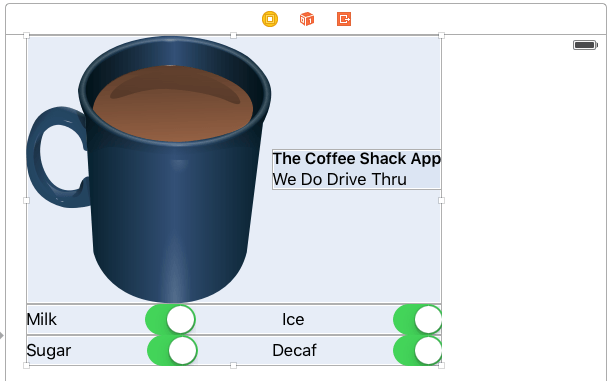
The next stack views to create are those containing the two rows of Switch and Label objects. From the Object Library panel, drag and drop four Label and four Switch objects onto the scene canvas so that they are positioned beneath the Banner Stack View. Edit the text on the labels so that the views match those contained in Figure 32-9:
Figure 32-9
Use click and drag to select the first row of labels and switches so that all four views are selected. Using the Stack button at the bottom of the storyboard, add these views to a new horizontal stack view. Referring to the Document Outline panel, change the name of this stack view to “Switches 1 Stack View”. Repeat these steps to add the second row to a stack view, this time named “Switches 2 Stack View”.
Select the Switches 1 Stack View in the Document Outline panel and, using the Attributes Inspector panel, change Alignment to Fill and Distribution to Equal Spacing. Repeat this step for the Switches 2 Stack View entry.
Creating the Top Level Stack View
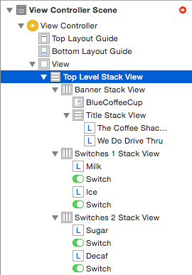
The next step is to add the existing stack views to a new vertical stack view. To achieve this, select all three of the stack views in the storyboard scene and click on the Stack button. Within the Document Outline panel locate this new parent stack view and change the name to “Top Level Stack View”. At this point verify that the view outline matches that of Figure 32-10:
Figure 32-10
Learn SwiftUI and take your iOS Development to the Next Level |
Learn SwiftUI and take your iOS Development to the Next Level |
Figure 32-11
Adding the Button Stack View
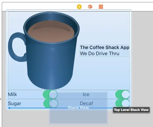
Two Button objects now need to be added to the Top Level Stack View but instead of using the Stack button, this time the button stack view and buttons will be added directly to the top level stack. With the Main.storyboard file selected, locate the Horizontal Stack View in the Object Library panel and drag it to the bottom edge of the Top Level Stack View in the storyboard scene so that a bold blue line appears together with a tag that reads “Top Level Stack View”:
Figure 32-12
Release the stack view to add it as a subview of the top level stack then use the Document Outline panel to name the stack “Button Stack View”. Drag and drop two Button views from the Object Library onto the new stack view. Select the Button Stack View entry in the Document Outline and change the Distribution property to Fill Equally. The buttons should now be spread equally over the width of the top level stack view.
With the left button selected change the text to read “Add a Cup” and change the background color property in the View section of the Attributes Inspector panel to green. Repeat these steps for the right-hand button, this time setting the text to “Remove a Cup” and the background color to cyan.
Display the Assistant Editor panel and establish action connections from the left and right buttons to methods named addCup and removeCup respectively.
Adding the Final Subviews to the Top Level Stack View
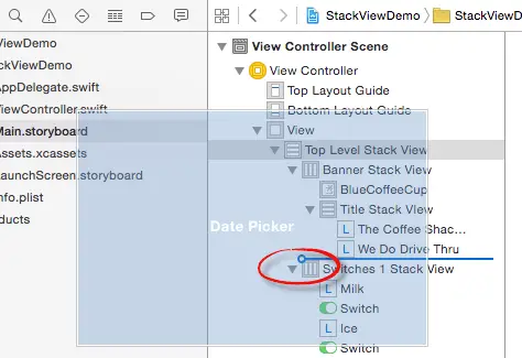
Two final subviews now need to be added to the top level stack view to complete the layout. From the Object Library panel, drag a Date Picker object and drop it immediately above the Switches 1 Stack View in the Document Outline panel. Be sure to move the object toward the left so that the blue insertion line extends to the left hand edge of the Switches 1 Stack View entry (highlighted in Figure 32-13) before dropping the view to ensure that it is added as a subview of the Top Level Stack View and not the banner or title stack views:
Figure 32-13
Repeat the above step to insert a Horizontal Stack View immediately above the Button Stack View, once again pulling the dragged view to the left before dropping to add the view to the Top Level Stack View. Once added, name the stack view “Cup Stack View”.
With the Cup Stack View entry selected in the Outline Panel, display the Attributes Inspector panel and set the Alignment and Distribution properties to Center and Fill Equally respectively.
Learn SwiftUI and take your iOS Development to the Next Level |
Figure 32-14
At this point in the project, the layout of the storyboard scene should appear as illustrated in Figure 32-15:
Figure 32-15
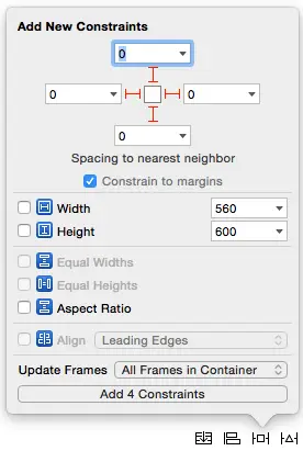
At this point Interface Builder may be indicating that some constraints are missing from some of the stack views. If so, to resolve this issue, select the View object in the Document Outline panel and choose the Add Missing Constraints option listed under All Views in View Controller in the Resolve Auto Layout Issues menu. Click the Update Frames button to reset the views to reflect the new constraints.
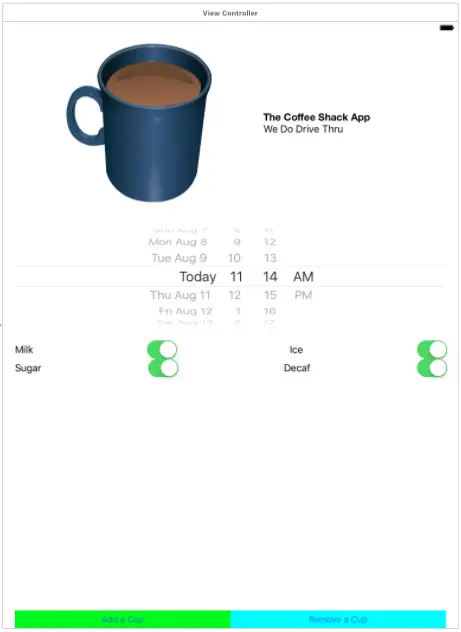
Compile and run the app on a physical iPhone 6s or 7 device or iPhone Simulator session and verify that the layout appears correctly.
Figure 32-16
Dynamically Adding and Removing Subviews
The final step is to add the code to the two action methods to add and remove the subviews within the Cups Stack View. Select this view in the storyboard scene, display the Assistant Editor and establish an outlet connection named cupStackView.
Within the ViewController.swift file, implement the code within the addCup method as follows:
@IBAction func addCup(_ sender: AnyObject) {

    let cupImage = UIImageView(image: UIImage(named: "RedCoffeeCup"))
    cupImage.contentMode = .scaleAspectFit

    UIView.animate(withDuration: 0.75, animations: {
        self.cupStackView.addArrangedSubview(cupImage)
        self.cupStackView.layoutIfNeeded()
    })
}
Learn SwiftUI and take your iOS Development to the Next Level |
The final step in this example is to add the code to remove the last coffee cup subview added to the stack within the removeCup method:
@IBAction func removeCup(_ sender: AnyObject) {

    let lastAddedCup = self.cupStackView.arrangedSubviews.last

    if let cup = lastAddedCup
    {
        UIView.animate(withDuration: 0.25, animations: {
            self.cupStackView.removeArrangedSubview(cup)
            cup.removeFromSuperview()
            self.cupStackView.layoutIfNeeded()
        })
    }
}
This method accesses the arrangedSubviews array of the stack view to obtain the last added subview. This subview is then removed both from the arrangedSubviews array and the subviews of the parent view, all from within an animation block.
Compile and run the app and test that the buttons now add and remove coffee cup subviews and that the changes are animated.
Summary
This chapter has worked through the creation of an example application that makes use of the UIStackView class. The tutorial demonstrated the use of horizontal and vertical stack views, stack view nesting, the addition of subviews to a stack in Interface Builder both manually and using the Stack button and the dynamic addition and removal of subviews from within code. The example also demonstrated the use of compression priority settings to fine tune the layout behavior of a stack view.
Learn SwiftUI and take your iOS Development to the Next Level |
| Previous | Table of Contents | Next |
| Working with the iOS 10 Stack View Class | Working with Directories in Swift on iOS 10 |
