An Introduction to the watchOS 2 WatchKit WKInterfacePicker Object
| Previous | Table of Contents | Next |
| A watchOS 2 App Custom Font Tutorial | A watchOS 2 WatchKit Picker Tutorial |
| Purchase the full edition of this watchOS 2 App Development Essentials book in eBook ($12.99) or Print ($27.99) format watchOS 2 App Development Essentials Print and eBook (ePub/PDF/Kindle) editions contain 35 chapters. |
Traditionally used to wind up or set the time on mechanical watches, Apple has cleverly repurposed the crown on the side of the Apple Watch as an input device. Named the “Digital Crown” the crown on the Apple Watch is used to perform tasks such as scrolling through lists of items and zooming in and out of content.
With the introduction of watchOS 2, the use of the Digital Crown as an input device is now available to WatchKit app developers through the WKInterfacePicker object. This object allows developers to build into WatchKit apps a variety of different features that respond to the Digital Crown.
This chapter will provide an overview of the capabilities of the WKInterfacePicker object before detailed examples are covered in subsequent chapters.
An Overview of the WKInterfacePicker Object
The WKInterfacePicker object (or picker object) is a versatile class designed specifically for connecting certain types of content displayed within a WatchKit app to the Digital Crown located on the side of the Apple Watch device. The object is primarily intended to present sequences of information to the user and can be configured to present those items using a number of different styles through which the user scrolls by rotating the Digital Crown.
The items presented by the picker object can take the form of text and images in a list format, or even as a sequence of images presented in a stack orientation where the Digital Crown flips from one image to another. Alternatively, images can be presented within the picker as a sequence through which the user smoothly animates back and forth as the crown is turned.
Adding a Picker Object to a Storyboard Scene
The WKInterfacePicker object is a visual user interface element which is added to a scene simply by dragging and dropping an instance from the Interface Builder Object Library panel onto the scene within the storyboard. Once added, an outlet connection will need to be established within the interface controller class so that the object can be managed from within the code of the WatchKit app. Multiple picker objects can be added to a single scene. When the user selects a picker object by tapping the screen, that picker is said to currently have focus, an indication of which can be shown using an optional outline configuration property.
Understanding Picker Object Attributes
The look and behavior of a picker object can be configured using a range of attributes which fall into the categories of style, focus and indicator, each of which can be specified from within the Attributes Inspector panel when a picker object is selected within the storyboard scene. Details of these attributes are as follows:
- Style – The style attribute dictates the visual appearance of the picker and the way in which the picker items are presented to the user. Each style option will be covered in greater detail in the next section of this chapter.
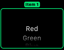
- Focus – The focus attribute dictates the way in which the picker object indicates that it currently has focus within the interface controller scene. A picker object is said to have focus when it is the currently selected item in the scene and is responding to the Digital Crown. Options available for this attribute are for an outline to appear around the picker, for an outline combined with a caption to be visible or for no outline to appear. Figure 25-1, for example, shows a picker object configured with both outline and caption:
Figure 25-1
- Indicator – This attribute controls whether or not an indicator is displayed in the top right hand corner of the picker object to provide a visual indication of the user’s progress through the list of items presented by the picker.
- Enabled – This attribute indicates whether the picker object is able to be selected by the user within the scene.
Understanding Picker Object Styles
A WKInterfacePicker instance can be configured to present content using one of three different styles:
- List – The list style presents the picker items in a vertical stack through which the user scrolls using the Digital Crown. Each item within the list can contain a title, a caption, an accessory image and a content image. The title takes the form of the text that is displayed for the item in the list. If the picker object is configured to display an outline with a caption, the caption property defines the text that is displayed within the outline of the picker. The optional accessory image appears to the left of the title text. The content image, if provided, appears in the background of the list item.
- Stack – When configured to use the stack style, the picker items are presented in a form resembling a stack of cards displaying images. At any one time only one item is visible. As the user turns the Digital Crown the current item is animated off the screen and the new one transitioned on screen.
- Image Sequence – The image sequence style is ideal for presenting an animated sequence of images whereby the user moves from frame to frame within the animation sequence using the Digital Crown. As outlined in the chapter entitled A WatchKit WKInterfacePicker Coordinated Animation Example, multiple animated sequences may be coordinated with the Digital Crown within a single interface controller scene.
| Purchase the full edition of this watchOS 2 App Development Essentials book in eBook ($12.99) or Print ($27.99) format watchOS 2 App Development Essentials Print and eBook (ePub/PDF/Kindle) editions contain 35 chapters. |
Creating Picker Item Objects
Each item displayed by a picker object is contained within an instance of the WKPickerItem class. When working in List mode, each picker item may be configured with a caption, title, content image and accessory image. For stacked and image sequence modes, only the contentImage property of the WKPickerItem object needs to be set. Images must be provided as WKImage objects.
The WKPickerItem objects are packaged into an array which is passed through to the setItems method of the picker object. The following code fragment demonstrates the initialization of a picker object configured to display both title and caption information:
var itemList: [(String, String)] = [
    ("Caption 1", "Red"),
    ("Caption 2", "Green"),
    ("Caption 3", "Blue")]

let pickerItems: [WKPickerItem] = itemList.map {
    let pickerItem = WKPickerItem()
    pickerItem.caption = $0.0
    pickerItem.title = $0.1
    return pickerItem
}

myPicker.setItems(pickerItems)
The following code, on the other hand is intended for use with a picker configured to use the stack or image sequence styles and populates the picker with a sequence of images contained within the WatchKit app bundle where the image filenames are numbered sequentially using the format my_image<n>.png:
var pickerItems = [WKPickerItem]()

for index in 0...10 {
    let pickerItem = WKPickerItem()
    pickerItem.contentImage = WKImage(imageName: "my_image\(index)")
    pickerItems.append(pickerItem)
}

myPicker.setItems(pickerItems)
Setting the Currently Selected Item
The currently selected picker item may be set programmatically using the setSelectedItemIndex method of the picker object passing through an Int value representing the item to be selected:
myPicker.setSelectedItemIndex(4)
Coordinating Animations
The animation within a picker object may be coordinated with other animations within the same scene using the setCoordinatedAnimations method of the picker object. The other animations within the scene can take the form of animated WKInterfaceImage objects or animations assigned to WKInterfaceGroup objects. The topic of coordinated animations is covered in greater detail in the chapter entitled A WatchKit WKInterfacePicker Coordinated Animation Example.
Requesting Focus for the Picker Object
A call to the focusForCrownInput method of a picker object will cause that object to gain focus within the scene in which it is embedded and begin receiving input from the Digital Crown:
myPicker.focusForCrownInput()
Enabling and Disabling a Picker Object
In addition to configuring the enabled status of a picker object within the Interface Builder environment at design time, this state may also be configured programmatically by calling the picker object’s setEnabled method. The following code, for example, disables the referenced picker object:
myPicker.setEnabled(false)
Responding to Picker Changes
When the user scrolls from one item to another within a picker object, an event is triggered which, if connected to an action method will result in a call to that method. This action connection can be established within Interface Builder by displaying the Assistant Editor panel and Ctrl-clicking and dragging from the picker object in the storyboard scene to a suitable location in the interface controller class file and establishing an action connection. Once connected, the method will be called each time the user changes the current selection and passed a value indicating the index of the current selection in the array of picker items.
Summary
The WKInterfacePicker class provides a way for developers to design WatchKit app behavior which responds to input from the Digital Crown control located on the side of the Apple Watch device. The picker object allows content to be presented in a number of different styles and navigated and selected using the Digital Crown. Content can be presented in list form including text and images or as a series of stacked images. Alternatively, content may also be presented in the form of an animation sequence.
Having covered the basics of the WKInterfacePicker class, the next two chapters (A watchOS 2 WatchKit Picker Tutorial and A WatchKit WKInterfacePicker Coordinated Animation Example) will work through examples of practical implementations of the picker object.
| Purchase the full edition of this watchOS 2 App Development Essentials book in eBook ($12.99) or Print ($27.99) format watchOS 2 App Development Essentials Print and eBook (ePub/PDF/Kindle) editions contain 35 chapters. |
| Previous | Table of Contents | Next |
| A watchOS 2 App Custom Font Tutorial | A watchOS 2 WatchKit Picker Tutorial |


