Working with the Floating Action Button and Snackbar
| Previous | Table of Contents | Next |
| Implementing Android 6 Scene Transitions – A Tutorial | Creating an Android Tabbed Interface using the TabLayout Component |
One of the objectives of this chapter is to provide an overview of the concepts of material design. Originally introduced as part of Android 5.0, material design is a set of design guidelines that dictate how the Android user interface, and that of the apps running on Android, appear and behave.
As part of the implementation of the material design concepts, Google also introduced the Android Design Support Library. This library contains a number of different components that allow many of the key features of material design to be built into Android applications. Two of these components, the floating action button and Snackbar, will also be covered in this chapter prior to introducing many of the other components in subsequent chapters.
The Material Design
The overall appearance of the Android environment is defined by the principles of material design. Material design was created by the Android team at Google and dictates that the elements that make up the user interface of Android and the apps that run on it appear and behave in a certain way in terms of behavior, shadowing, animation and style. One of the tenets of the material design is that the elements of a user interface appear to have physical depth and a sense that items are constructed in layers of physical material. A button, for example, appears to be raised above the surface of the layout in which it resides through the use of shadowing effects. Pressing the button causes the button to flex and lift as though made of a thin material that ripples when released.
Material design also dictates the layout and behavior of many standard user interface elements. A key example is the way in which the app bar located at the top of the screen should appear and the way in which it should behave in relation to scrolling activities taking place within the main content of the activity.
In fact, material design covers a wide range of areas from recommended color styles to the way in which objects are animated. A full description of the material design concepts and guidelines can be found online at the following link and is recommended reading for all Android developers:
https://www.google.com/design/spec/material-design/introduction.html
The Design Library
Many of the building blocks needed to implement Android applications that adopt the principles of material design are contained within the Android Design Support Library. This library contains a collection of user interface components that can be included in Android applications to implement much of the look, feel and behavior of material design. Two of the components from this library, the floating action button and Snackbar will be covered in this chapter while others will be introduced in later chapters.
The Floating Action Button (FAB)
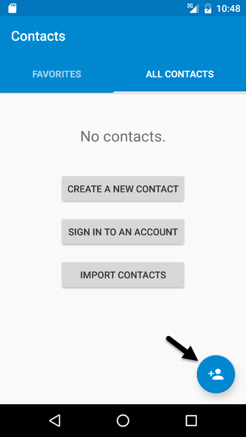
The floating action button is a button which appears to float above the surface of the user interface of an app and is generally used to promote the most common action within a user interface screen. A floating action button might, for example, be placed on a screen to allow the user to add an entry to a list of contacts or to send an email from within the app. Figure 30 1, for example, highlights the floating action button that allows the user to add a new contact within the standard Android Contacts app:
Figure 30-1
To conform with the material design guidelines, there are a number of rules that should be followed when using floating action buttons. Floating action buttons must be circular and can be either 56 x 56dp (Default) or 40 x 40dp (Mini) in size. The button should be positioned a minimum of 16dp from the edge of the screen on phones and 24dp on desktops and tablet devices. Regardless of the size, the button must contain an interior icon that is 24x24dp in size and it is recommended that each user interface screen have only one floating action button.
Floating action buttons can be animated or designed to morph into other items when touched. A floating action button could, for example, rotate when tapped or morph into another element such as a toolbar or panel listing related actions.
The Snackbar
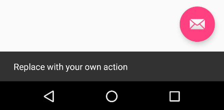
<google>ADSDAQBOX_FLOW</google> The Snackbar component provides a way to present the user with information in the form of a panel that appears at the bottom of the screen as shown in Figure 30 2. Snackbar instances contain a brief text message and an optional action button which will perform a task when tapped by the user. Once displayed, a Snackbar will either timeout automatically or can be removed manually by the user via a swiping action. During the appearance of the Snackbar the app will continue to function and respond to user interactions in the normal manner.
Figure 30-2
In the remainder of this chapter an example application will be created that makes use of the basic features of the floating action button and Snackbar to add entries to a list of items.
Creating the Example Project
Create a new project in Android Studio, entering FabExample into the Application name field and ebookfrenzy.com as the Company Domain setting before clicking on the Next button.
On the form factors screen, enable the Phone and Tablet option and set the minimum SDK setting to API 8: Android 2.2 (Froyo).
Although it is possible to manually add a floating action button to an activity, it is much easier to use the Blank Activity template which includes a floating action button by default. Continue to proceed through the screens, therefore, requesting the creation of a blank activity named FabExampleActivity with corresponding layout and menu files named activity_fab_example and menu_fab_example respectively.
Click on the Finish button to initiate the project creation process.
Reviewing the Project
Since the blank activity template was selected, the activity contains two layout files. The activity_fab_example.xml file consists of a CoordinatorLayout manager containing entries for an app bar, a toolbar and a floating action button.
The content_fab_example.xml file represents the layout of the content area of the activity and contains a RelativeLayout instance and a TextView. This file is embedded into the activity_fab_example.xml file via the following include directive:
<include layout="@layout/content_fab_example" />
The floating action button element within the activity_fab_example.xml file reads as follows:
<android.support.design.widget.FloatingActionButton
    android:id="@+id/fab"
    android:layout_width="wrap_content"
    android:layout_height="wrap_content"
    android:layout_gravity="bottom|end"
    android:layout_margin="@dimen/fab_margin"
    android:src="@android:drawable/ic_dialog_email" />
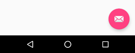
This declares that the button is to appear in the bottom right hand corner of the screen with margins represented by the fab_margin identifier in the values/dimens.xml file (which in this case is set to 16dp). The XML further declares that the interior icon for the button is to take the form of the standard drawable built-in email icon.
The blank template has also configured the floating action button to display a Snackbar instance when tapped by the user. The code to implement this can be found in the onCreate() method of the FabExampleActivity.java file and reads as follows:
FloatingActionButton fab =
		(FloatingActionButton) findViewById(R.id.fab);

fab.setOnClickListener(new View.OnClickListener() {
    @Override
    public void onClick(View view) {
        Snackbar.make(view, "Replace with your own action",
		Snackbar.LENGTH_LONG)
                .setAction("Action", null).show();
    }
});
The code obtains a reference to the floating action button via the button’s id and adds to it an onClickListener handler to be called when the button is tapped. This method simply displays a Snackbar instance configured with a message but no actions.
Finally, open the module level build.gradle file (Gradle Scripts -> build.gradle (Module: App)) and note that the Android design support library has been added as a dependency:
compile 'com.android.support:design:23.1.0'
Figure 30-3
Tapping the floating action button will trigger the onClickListener handler method causing the Snackbar to appear at the bottom of the screen:
Figure 30-4
When the Snackbar appears on a narrower device (as is the case in Figure 30-4 above) note that the floating action button is moved up to make room for the Snackbar to appear. This is handled for us automatically by the CoordinatorLayout container in the activity_fab_example.xml layout resource file.
Changing the Floating Action Button
Since the objective of this example is to configure the floating action button to add entries to a list the email icon currently displayed on the button needs to be changed to something more indicative of the action being performed. The icon that will be used for the button is named ic_add_entry.png and can be found in the project_icons folder of the sample code download available from the following URL:
http://www.ebookfrenzy.com/code/AndroidStudioA6Book.zip
Locate this image in the file system navigator for your operating system and copy the image file. Right-click on the app -> res -> drawable entry in the Project tool window and select Paste from the menu to add the file to the folder:
Figure 30-5
Next, edit the activity_fab_example.xml file and change the image source for the icon from @android:drawable/ic_dialog_email to @drawable/ic_add_entry as follows:
<android.support.design.widget.FloatingActionButton
    android:id="@+id/fab"
    android:layout_width="wrap_content"
    android:layout_height="wrap_content"
    android:layout_gravity="bottom|end"
    android:layout_margin="@dimen/fab_margin"
    android:src="@drawable/ic_add_entry" />
Within the layout preview, the interior icon for the button will now have changed to a plus sign.
The background color of the floating action button is defined by the accentColor property of the prevailing theme used by the application. The color assigned to this value is declared in the colors.xml file located under app -> res -> values in the Project tool window. Edit this file and add a new color named colorBrightAccent:
<?xml version="1.0" encoding="utf-8"?>
<resources>
    <color name="colorPrimary">#3F51B5</color>
    <color name="colorPrimaryDark">#303F9F</color>
    <color name="colorAccent">#FF4081</color>
    <color name="colorBrightAccent">#FFFF00</color>
</resources>
Next, edit the styles.xml file located under app -> res -> values -> styles and change the colorAccent entry to use the new colorBrightAccent value:
<resources>
    <!-- Base application theme. -->
    <style name="AppTheme"
            parent="Theme.AppCompat.Light.DarkActionBar">
        <!-- Customize your theme here. -->
        <item name="colorPrimary">@color/colorPrimary</item>
        <item name="colorPrimaryDark">@color/colorPrimaryDark</item>
        <item name="colorAccent">@color/colorBrightAccent</item>
    </style>
    <style name="AppTheme.NoActionBar">
        <item name="windowActionBar">false</item>
        <item name="windowNoTitle">true</item>
    </style>
    <style name="AppTheme.AppBarOverlay"
        parent="ThemeOverlay.AppCompat.Dark.ActionBar" />
    <style name="AppTheme.PopupOverlay"
        parent="ThemeOverlay.AppCompat.Light" />
</resources>
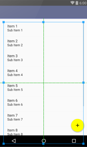
Return to the activity_fab_example.xml and verify that the floating action button now appears with a yellow background.
Adding the ListView to the Content Layout
The next step in this tutorial is to add the ListView instance to the content_fab_example.xml file. The ListView class provides a way to display items in a list format and can be found in the Containers section of the Designer tool palette.
Load the content_fab_example.xml file into the Designer tool, select Design mode if necessary and select and delete the default TextView object. Locate the ListView object in the palette and drag and drop it onto the center of the layout canvas so that it appears as illustrated in Figure 30-6:
Figure 30-6
With the ListView selected, use the toolbar buttons or Properties tool window to set the layout:width and layout:height properties to match_parent. Double click on the newly added ListView object and change the ID to listView if it is not already set to this value.
Adding Items to the ListView
Each time the floating action button is tapped by the user, a new item will be added to the ListView in the form of the prevailing time and date. To achieve this, some changes need to be made to the FabExampleActivity.java file.
Begin by modifying the onCreate() method to obtain a reference to the ListView and to initialize an adapter instance to allow us to add items to the list in the form of an array:
import android.os.Bundle;
import android.support.design.widget.FloatingActionButton;
import android.support.design.widget.Snackbar;
import android.support.v7.app.AppCompatActivity;
import android.support.v7.widget.Toolbar;
import android.view.View;
import android.view.Menu;
import android.view.MenuItem;
import android.widget.ArrayAdapter;
import android.widget.ListView;

import java.util.ArrayList;

public class FabExampleActivity extends AppCompatActivity {

    ArrayList<String> listItems = new ArrayList<String>();
    ArrayAdapter<String> adapter;
    private ListView myListView;

    @Override
    protected void onCreate(Bundle savedInstanceState) {
        super.onCreate(savedInstanceState);
        setContentView(R.layout.activity_fab_example);
        Toolbar toolbar = (Toolbar) findViewById(R.id.toolbar);
        setSupportActionBar(toolbar);

        myListView = (ListView) findViewById(R.id.listView);

        adapter = new ArrayAdapter<String>(this,
                android.R.layout.simple_list_item_1,
                listItems);
        myListView.setAdapter(adapter);

        FloatingActionButton fab = (FloatingActionButton)
				findViewById(R.id.fab);
        fab.setOnClickListener(new View.OnClickListener() {
            @Override
            public void onClick(View view) {
                Snackbar.make(view, "Replace with your own action",
			Snackbar.LENGTH_LONG)
                        .setAction("Action", null).show();
            }
        });
    }
.
.
.
}
The ListView needs an array of items to display, an adapter to manage the items in that array and a layout definition to dictate how items are to be presented to the user.
In the above code changes, the items are stored in an ArrayList instance assigned to an adapter that takes the form of an ArrayAdapter. The items added to the list will be displayed in the ListView using the simple_list_item_1 layout, a built-in layout that is provided with Android to display simple string based items in a ListView instance.
Next, edit the onClickListener code for the floating action button to display a different message in the Snackbar and to call a method to add an item to the list:
FloatingActionButton fab = (FloatingActionButton)
				findViewById(R.id.fab);
fab.setOnClickListener(new View.OnClickListener() {
    @Override
    public void onClick(View view) {
        addListItem();
        Snackbar.make(view, "Item added to list",
		Snackbar.LENGTH_LONG)
                .setAction("Action", null).show();

    }
});
Remaining within the FabExampleActivity.java file, add the addListItem() method as follows:
package com.ebookfrenzy.fabexample;
.
.
.
import java.text.SimpleDateFormat;
import java.util.Date;
import java.util.Locale;

public class FabExampleActivity extends AppCompatActivity {
.
.
    private void addListItem() {

        SimpleDateFormat dateformat =
                new SimpleDateFormat("HH:mm:ss MM/dd/yyyy",
                        Locale.US);
        listItems.add(dateformat.format(new Date()));
        adapter.notifyDataSetChanged();
    }
.
.
}
The code in the addListItem() method identifies and formats the current date and time and adds it to the list items array. The array adapter assigned to the ListView is then notified that the list data has changed, causing the ListView to update to display the latest list items.
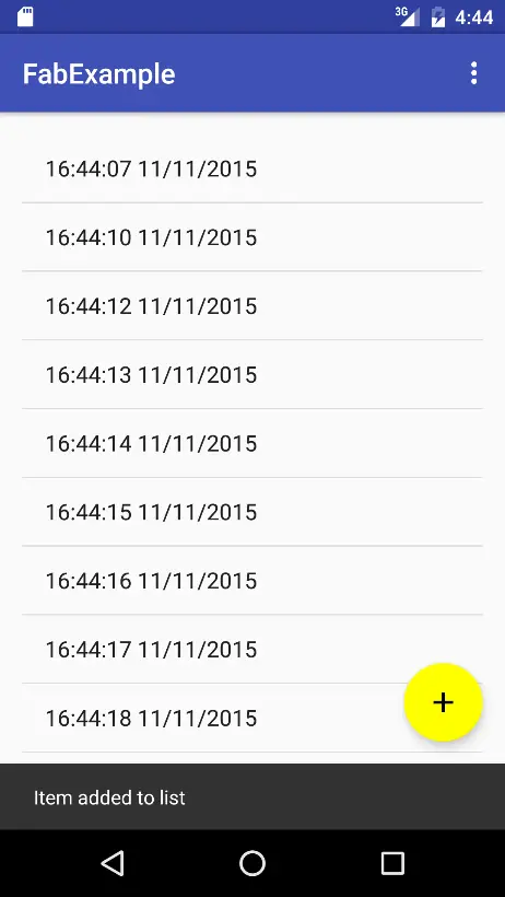
Compile and run the app and test that tapping the floating action button adds new time and date entries to the ListView, displaying the Snackbar each time as shown in Figure 30-7:
Figure 30-7
Adding an Action to the Snackbar
The final task in this project is to add an action to the Snackbar that allows the user to undo the most recent addition to the list. Edit the FabExampleActivity.java file and modify the Snackbar creation code to add an action titled “Undo” configured with an onClickListener named undoOnClickListener:
fab.setOnClickListener(new View.OnClickListener() {
    @Override
    public void onClick(View view) {
        addListItem();
        Snackbar.make(view, "Item added to list",
		Snackbar.LENGTH_LONG)
                .setAction("Undo", undoOnClickListener).show();

    }
});
View.OnClickListener undoOnClickListener = new View.OnClickListener() {
    @Override
    public void onClick(View view) {
        listItems.remove(listItems.size() -1);
        adapter.notifyDataSetChanged();
        Snackbar.make(view, "Item removed", Snackbar.LENGTH_LONG)
                .setAction("Action", null).show();
    }
};
The code in the onClick method identifies the location of the last item in the list array and removes it from the list before triggering the list view to perform an update. A new Snackbar is then displayed indicating that the last item has been removed from the list.
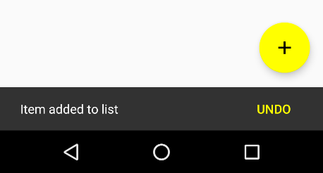
Run the app once again and add some items to the list. On the final addition, tap the Undo button in the Snackbar (Figure 30-8) to remove the last item from the list:
Figure 30-8
It is also worth noting that the Undo button appears using the same colorBrightAccent color assigned to the accentColor property in the styles.xml file earlier in the chapter.
Summary
This chapter has provided a general overview of material design, the floating action button and Snackbar before working through an example project that makes use of these features
Both the floating action button and the Snackbar are part of the material design approach to user interface implementation in Android. The floating action button provides a way to promote the most common action within a particular screen of an Android application. The Snackbar allows an application to present information to the user and to allow the user to take action from within the bar.
| Previous | Table of Contents | Next |
| Implementing Android 6 Scene Transitions – A Tutorial | Creating an Android Tabbed Interface using the TabLayout Component |


