
If you have spent an appreciable amount of time using iOS, the chances are good that you have interacted with a UIKit Table View object. This is because table Views are the cornerstone of the navigation system for many iOS apps. For example, both the iPhone Mail and Settings apps extensively use Table Views to present information to users in a list format and to enable users to drill down to more detailed information by selecting a particular list item.
Historically, table views have been one of the more complex areas of iOS user interface implementation. In recognition of this, Apple introduced ways to implement table views using the Xcode Storyboard feature.
This chapter aims to provide an overview of the concept of the UITableView class and an introduction to how storyboards can be used to ease the table view implementation process. Once these basics have been covered, a series of chapters, starting with Using Xcode Storyboards to Build Dynamic TableViews, will work through the creation of example projects intended to demonstrate the use of storyboards in the context of table views.
An Overview of the Table View
Table Views present the user with data in a list format and are represented by the UITableView class of the UIKit framework. The data is presented in rows, whereby the content of each row is implemented in the form of a UITableViewCell object. By default, each table cell can display a text label (textLabel), a subtitle (detailedTextLabel), and an image (imageView). More complex cells can be created by either adding subviews to the cell or subclassing UITableViewCell and adding your own custom functionality and appearance.
Static vs. Dynamic Table Views
When implementing table views using an Xcode storyboard, it is important to understand the distinction between static and dynamic tables. Static tables are helpful in situations when a fixed number of rows need to be displayed in a table. For example, the settings page for an app would typically have a predetermined number of configuration options and would be an ideal candidate for a static table.
 |
You are reading a sample chapter from Building iOS 17 Apps using Xcode Storyboards.
Buy the full book now in eBook or Print format. The full book contains 96 chapters and 760 pages of in-depth information. |
On the other hand, dynamic tables (also known as prototype-based tables) are intended for use when a variable number of rows need to be displayed from a data source. Within the storyboard editor, Xcode allows you to visually design a prototype table cell which will then be replicated in the dynamic table view at runtime to display data to the user.
The Table View Delegate and dataSource
Each table view in an app must have a delegate and a dataSource associated with it (except for static tables, which do not have a data source). The dataSource implements the UITableViewDataSource protocol, which consists of several methods that define title information, how many rows of data are to be displayed, how the data is divided into different sections, and, most importantly, supplies the table view with the cell objects to be displayed. The delegate implements the UITableViewDelegate protocol and provides additional control over the table view’s appearance and functionality, including detecting when a user touches a specific row, defining custom row heights and indentations, and implementing row deletion and editing functions.
Table View Styles
Table views may be configured to use either plain or grouped style. In the grouped style, the rows are grouped in sections separated by optional headers and footers. For example, Figure 27-1 shows a table view configured to use the grouped style:

In the case of the plain style, the items are listed without separation and using the entire width of the display:
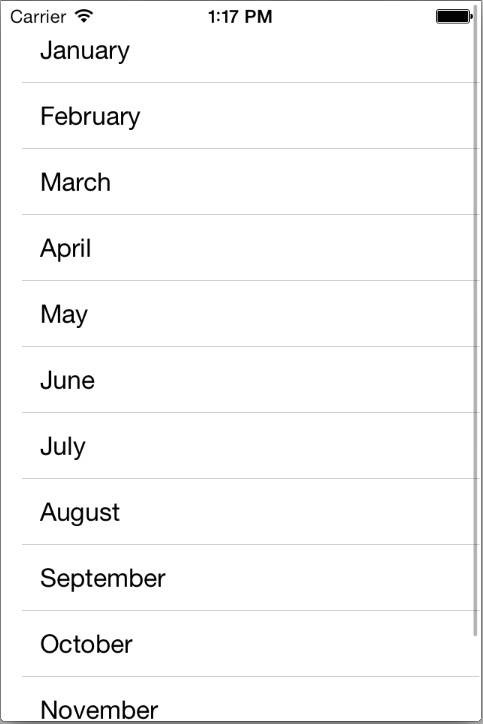
Table Views using plain style can also be indexed, whereby rows are organized into groups according to specified criteria, such as alphabetical or numerical sorting.
|
You are reading a sample chapter from Building iOS 17 Apps using Xcode Storyboards.
Buy the full book now in eBook or Print format. The full book contains 96 chapters and 760 pages of in-depth information. |
Self-Sizing Table Cells
With self-sizing cells, each row of a table is sized according to the content of the corresponding cell based on the Auto Layout constraints applied to the cell contents. Self-sizing will be demonstrated in the next chapter entitled Using Xcode Storyboards to Build Dynamic TableView but it is particularly important when the labels in a cell are configured to use dynamic type.
Dynamic Type
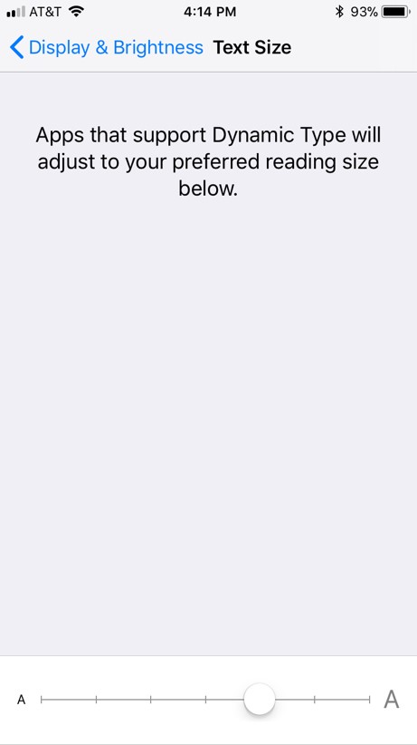
iOS allows users to select a preferred text size that apps must adopt when displaying text. The current text size can be configured on a device via the Settings -> Display & Brightness -> Text Size screen, which provides a slider to adjust the font size, as shown in Figure 27-3:
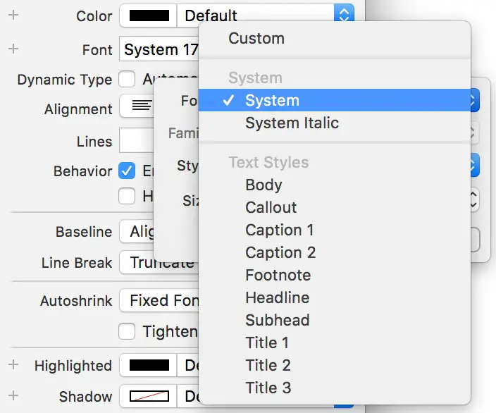
Almost without exception, the built-in iOS apps adopt the font size setting selected by the user when displaying text. Apple recommends that third-party apps also conform to the user’s text size selection, and since iOS 8, support for dynamic type has been extended to table views. This is achieved by specifying a preferred text style setting for the font of any custom labels in a cell. iOS specifies various preferred text styles for this purpose, including headings, sub-headings, body, captions, and footnotes. The text style used by a label can be configured using Interface Builder or in code. To configure the text style in Interface Builder, select the label, display the Attributes Inspector, and click on the “T” button in the font setting field, as demonstrated in Figure 27-4. Next, from the drop-down menu, click on the Font menu button and select an item from the options listed under the Text Styles heading:
The preferred font is configured in code by setting the preferredFont property to one of the following preconfigured text style values:
- UIFontTextStyle.headline
- UIFontTextStyle.subheadline
- UIFontTextStyle.body
- UIFontTextStyle.callout
- UIFontTextStyle.footnote
- UIFontTextStyle.caption1
- UIFontTextStyle.caption2
The following code, for example, sets a dynamic type font on a label using the headline font style:
|
You are reading a sample chapter from Building iOS 17 Apps using Xcode Storyboards.
Buy the full book now in eBook or Print format. The full book contains 96 chapters and 760 pages of in-depth information. |
cell.myLabel.font =
	UIFont.preferredFont(forTextStyle: .headline)Code language: Swift (swift)
The text size selected by a user will dictate the size of any cells containing labels that use dynamic type, hence the importance of using self-sizing to ensure the table rows are displayed using an appropriate height.
Table View Cell Styles
In addition to the style of the Table View itself, different styles may also be specified for the individual table cells (unless custom table cells are being used). The iOS SDK currently supports four different cell styles:
- UITableViewCellStyle.default – only the labelText in black and left aligned.
- UITableViewCellStyle.subtitle – labelText in black and left aligned with the detailLabelText positioned beneath it in a smaller font using a gray foreground.
- UITableViewCellStyle.value1 – labelText in black, left aligned, and the smaller detailLabelText in blue, on the same line and right-aligned.
- UITableViewCellStyle.value2 – labelText in blue on the left side of the cell, right aligned and detailedLabelText on the right of the cell, left aligned and black.
Table View Cell Reuse
At the basic level, a table view comprises a UITableView object and a UITableViewCell for each row to be displayed. The code for a typical iOS app using a table view will not directly create instances of a cell. The reasoning behind this becomes evident when performance and memory requirements are considered. Consider, for example, a table view that is required to display 1000 photo images. It can be assumed with a reasonable degree of certainty that only a small percentage of cells will be visible to the user at any one time. If the app were permitted to create each 1000 cells in advance, the device would quickly run into memory and performance limitations.
Instead, the app begins by registering with the table view object the class to be used for cell objects and the reuse identifier previously assigned to that class. If the cell class was written in code, the registration is performed using the register method of the UITableView object. For example:
self.tableView.register(AttractionTableViewCell.self,
			forCellReuseIdentifier: "MyTableCell")Code language: Swift (swift)
If the cell is contained within an Interface Builder NIB file, the registerNib method is used instead.
|
You are reading a sample chapter from Building iOS 17 Apps using Xcode Storyboards.
Buy the full book now in eBook or Print format. The full book contains 96 chapters and 760 pages of in-depth information. |
Perhaps the most critical point to remember from this chapter is that if the cell is created using prototypes within a storyboard, it is unnecessary to register the class. Doing so will prevent the cell or view from appearing when the app runs.
As the table view initializes, it calls the tableView(_:cellForRowAt:) method of the datasource class passing through the index path for which a cell object is required. This method will then call the dequeueReusableCell method of the table view object, passing through both the index path and the reuse ID assigned to the cell class when it was registered to find out if there is a reusable cell object in the queue that can be used for this new cell. Since this is the initialization phase and no cells have been deemed eligible for reuse, the method will create a new cell and return it. Once all the visible cells have been created, the table view will stop asking for more cells. The code for the tableView(_:cellForRowAt:) method will typically read as follows (the code to customize the cell before returning it will be implementation specific):
override func tableView(_ tableView: UITableView, cellForRowAt indexPath:
     IndexPath) -> UITableViewCell {

    let cell =
        self.tableView.dequeueReusableCell(withIdentifier:
            "MyTableCell", for: indexPath)
                    as! MyTableViewCell

    // Configure the cell here
    return cell
}Code language: Swift (swift)
As the user scrolls through the table view, some cells will move out of the visible frame. When this happens, the table view places them on the reuse queue. As cells are moving out of view, new ones will likely come into view. For each cell moving into the view area, the table view will call tableView(_:cellForRowAt:). This time, however, when a call to the dequeueReusableCell method is made, it is most likely that an existing cell object will be returned from the reuse queue, thereby avoiding the necessity to create a new object.
Table View Swipe Actions
The TableView delegate protocol provides delegate methods that allow the app to respond to left and right swipes over table rows by displaying an action button. Figure 27-5, for example, shows a leading swipe action configured with an action titled “Share”:

The two delegate methods are declared as follows:
|
You are reading a sample chapter from Building iOS 17 Apps using Xcode Storyboards.
Buy the full book now in eBook or Print format. The full book contains 96 chapters and 760 pages of in-depth information. |
override func tableView(_ tableView: UITableView,
  leadingSwipeActionsConfigurationForRowAt indexPath: IndexPath) ->
   UISwipeActionsConfiguration? {

}

override func tableView(_ tableView: UITableView,
 trailingSwipeActionsConfigurationForRowAt indexPath: IndexPath) ->
  UISwipeActionsConfiguration? {
}Code language: Swift (swift)
The methods return a UISwipeActionsConfiguration object configured with the action to be performed. This consists of a UIContextualAction object configured with a style (either destructive or normal), the title to appear in the action, and a completion handler to be called when the user taps the action button, for example:
override func tableView(_ tableView: UITableView,
 leadingSwipeActionsConfigurationForRowAt indexPath: IndexPath) ->
  UISwipeActionsConfiguration? {

    let configuration = UISwipeActionsConfiguration(actions: [
        UIContextualAction(style: .normal, title: "Share",
          handler: { (action, view, completionHandler) in

            // Code here will be executed when the user selects the action

            completionHandler(true)
        })
    ])
    return configuration
}Code language: Swift (swift)
Destructive actions appear in red when displayed and remove the corresponding row from the table view when selected, while normal actions appear in gray and do not remove the row.
Summary
While table views provide a popular mechanism for displaying data and implementing view navigation within apps, implementation has historically been a complex process. That changed with the introduction of storyboard support in Xcode. Xcode provides a mechanism for visually implementing a considerable amount of Table View functionality with minimal coding. Such table views can be either static or dynamic depending on the requirements of the table and the nature of the data being displayed.
The text within a table cell should be configured using text styles rather than specific font settings. This allows the text to appear in accordance with the user’s device-wide text preferences as defined in the Settings app.
iOS also supports swipe actions within TableViews, allowing options to be presented when the user swipes left or right on a table cell.
|
You are reading a sample chapter from Building iOS 17 Apps using Xcode Storyboards.
Buy the full book now in eBook or Print format. The full book contains 96 chapters and 760 pages of in-depth information. |