
As discussed in the chapter entitled Android Views, View Groups, and Layouts, Android provides several layout managers to design user interfaces. With Android 7, Google introduced a layout that addressed many of the shortcomings of the older layout managers. This layout, called ConstraintLayout, combines a simple, expressive, and flexible layout system with powerful features built into the Android Studio Layout Editor tool to ease the creation of responsive user interface layouts that adapt automatically to different screen sizes and changes in device orientation.
This chapter will outline the basic concepts of ConstraintLayout, while the next chapter will provide a detailed overview of how constraint-based layouts can be created using ConstraintLayout within the Android Studio Layout Editor tool.
How ConstraintLayout Works
In common with all other layouts, ConstraintLayout manages the positioning and sizing behavior of the visual components (also referred to as widgets) it contains. It does this based on the constraint connections set on each child widget.
To fully understand and use ConstraintLayout, it is essential to gain an appreciation of the following key concepts:
- Constraints
- Margins
- Opposing Constraints
- Constraint Bias
- Chains
- Chain Styles
- Guidelines
- Groups
- Barriers
- Flow
Constraints
Constraints are sets of rules that dictate how a widget is aligned and distanced relative to other widgets, the sides of the containing ConstraintLayout, and special elements called guidelines. Constraints also dictate how the user interface layout of an activity will respond to changes in device orientation or when displayed on devices of differing screen sizes. To be adequately configured, a widget must have sufficient constraint connections such that its position can be resolved by the ConstraintLayout layout engine in both the horizontal and vertical planes.
 |
You are reading a sample chapter from Android Studio Giraffe Essentials – Kotlin Edition.
Buy the full book now in eBook (PDF) or Print format. The full book contains 94 chapters and over 830 pages of in-depth information. |
Margins
A margin is a form of constraint that specifies a fixed distance. Consider a Button object that needs to be positioned near the top right-hand corner of the device screen. This might be achieved by implementing margin constraints from the top and right-hand edges of the Button connected to the corresponding sides of the parent ConstraintLayout, as illustrated in Figure 25-1:
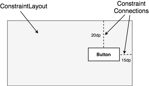
As indicated in the above diagram, each of these constraint connections has associated with it a margin value dictating the fixed distances of the widget from two sides of the parent layout. Under this configuration, regardless of screen size or the device orientation, the Button object will always be positioned 20 and 15 device-independent pixels (dp) from the top and right-hand edges of the parent ConstraintLayout, respectively, as specified by the two constraint connections.
While the above configuration will be acceptable for some situations, it does not provide any flexibility in terms of allowing the ConstraintLayout layout engine to adapt the position of the widget to respond to device rotation and to support screens of different sizes. To add this responsiveness to the layout, it is necessary to implement opposing constraints.
Opposing Constraints
Two constraints operating along the same axis on a single widget are considered opposing constraints. In other words, a widget with constraints on both its left and right-hand sides is considered to have horizontally opposing constraints. Figure 25-2, for example, illustrates the addition of both horizontally and vertically opposing constraints to the previous layout:
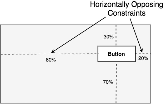
The key point to understand here is that once opposing constraints are implemented on a particular axis, the positioning of the widget becomes percentage rather than coordinate-based. Instead of being fixed at 20dp from the top of the layout, for example, the widget is now positioned at 30% from the top. In different orientations and when running on larger or smaller screens, the Button will always be in the same location relative to the dimensions of the parent layout.
|
You are reading a sample chapter from Android Studio Giraffe Essentials – Kotlin Edition.
Buy the full book now in eBook (PDF) or Print format. The full book contains 94 chapters and over 830 pages of in-depth information. |
It is now important to understand that the layout outlined in Figure 25-2 has been implemented using not only opposing constraints, but also by applying constraint bias.
Constraint Bias
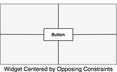
It has now been established that a widget in a ConstraintLayout can potentially be subject to opposing constraint connections. By default, opposing constraints are equal, resulting in the corresponding widget being centered along the axis of opposition. Figure 25-3, for example, shows a widget centered within the containing ConstraintLayout using opposing horizontal and vertical constraints:
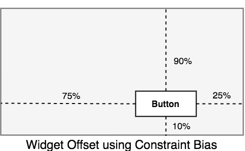
To allow for the adjustment of widget position in the case of opposing constraints, the ConstraintLayout implements a feature known as constraint bias. Constraint bias allows the positioning of a widget along the axis of opposition to be biased by a specified percentage in favor of one constraint. Figure 25-4, for example, shows the previous constraint layout with a 75% horizontal bias and 10% vertical bias:
The next chapter, entitled Using ConstraintLayout in Android Studio, will cover these concepts in greater detail and explain how these features have been integrated into the Android Studio Layout Editor tool.
In the meantime, however, a few more areas of the ConstraintLayout class need to be covered.
|
You are reading a sample chapter from Android Studio Giraffe Essentials – Kotlin Edition.
Buy the full book now in eBook (PDF) or Print format. The full book contains 94 chapters and over 830 pages of in-depth information. |
Chains
ConstraintLayout chains provide a way for the layout behavior of two or more widgets to be defined as a group. Chains can be declared in either the vertical or horizontal axis and configured to define how the widgets in the chain are spaced and sized.
Widgets are chained when connected by bi-directional constraints. Figure 25-5, for example, illustrates three widgets chained in this way:
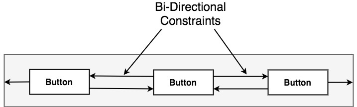
The first element in the chain is the chain head which translates to the top widget in a vertical chain or, in the case of a horizontal chain, the left-most widget. The layout behavior of the entire chain is primarily configured by setting attributes on the chain head widget.
Chain Styles
The layout behavior of a ConstraintLayout chain is dictated by the chain style setting applied to the chain head widget. The ConstraintLayout class currently supports the following chain layout styles:
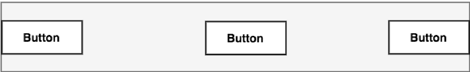
- Spread Chain – The widgets within the chain are distributed evenly across the available space. This is the default behavior for chains.
- Spread Inside Chain – The widgets within the chain are spread evenly between the chain head and the last widget. The head and last widgets are not included in the distribution of spacing.
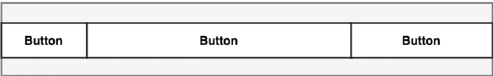
- Weighted Chain – Allows the space taken up by each widget in the chain to be defined via weighting properties.
- Packed Chain – The widgets that make up the chain are packed together without spacing. A bias may be applied to control the horizontal or vertical positioning of the chain relative to the parent container.
Baseline Alignment
So far, this chapter has only referred to constraints that dictate alignment relative to the sides of a widget (typically referred to as side constraints). A common requirement, however, is for a widget to be aligned relative to the content that it displays rather than the boundaries of the widget itself. To address this need, ConstraintLayout provides baseline alignment support.
|
You are reading a sample chapter from Android Studio Giraffe Essentials – Kotlin Edition.
Buy the full book now in eBook (PDF) or Print format. The full book contains 94 chapters and over 830 pages of in-depth information. |
For example, assume that the previous theoretical layout from Figure 25-1 requires a TextView widget to be positioned 40dp to the left of the Button. In this case, the TextView needs to be baseline aligned with the Button view. This means that the text within the Button needs to be vertically aligned with the text within the TextView. The additional constraints for this layout would need to be connected as illustrated in Figure 25-10:
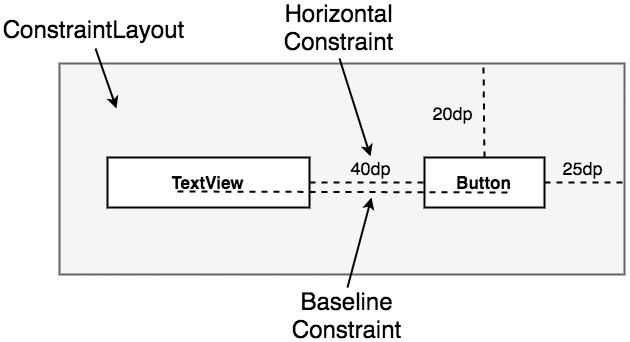
The TextView is now aligned vertically along the baseline of the Button and positioned 40dp horizontally from the Button object’s left-hand edge.
Configuring Widget Dimensions
Controlling the dimensions of a widget is a key element of the user interface design process. The ConstraintLayout provides three options that can be set on individual widgets to manage sizing behavior. These settings are configured individually for height and width dimensions:
- Fixed – The widget is fixed to specified dimensions.
- Match Constraint –Allows the widget to be resized by the layout engine to satisfy the prevailing constraints. Also referred to as the AnySize or MATCH_CONSTRAINT option.
- Wrap Content – The widget’s size is dictated by its content (i.e., text or graphics).
Guideline Helper
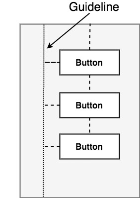
Guidelines are special elements available within the ConstraintLayout that provide an additional target to which constraints may be connected. Multiple guidelines may be added to a ConstraintLayout instance which may, in turn, be configured in horizontal or vertical orientations. Once added, constraint connections may be established from widgets in the layout to the guidelines. This is particularly useful when multiple widgets must be aligned along an axis. In Figure 25-11, for example, three Button objects contained within a ConstraintLayout are constrained along a vertical guideline:
Group Helper
This feature of ConstraintLayout allows widgets to be placed into logical groups, and the visibility of those widgets controlled as a single entity. A Group is a list of references to other widgets in a layout. Once defined, changing the visibility attribute (visible, invisible, or gone) of the group instance will apply the change to all group members. This makes hiding and showing multiple widgets with a single attribute change easy. A single layout may contain multiple groups, and a widget can belong to more than one group. If a conflict occurs between groups, the last group to be declared in the XML file takes priority.
|
You are reading a sample chapter from Android Studio Giraffe Essentials – Kotlin Edition.
Buy the full book now in eBook (PDF) or Print format. The full book contains 94 chapters and over 830 pages of in-depth information. |
Barrier Helper
Rather like guidelines, barriers are virtual views that can be used to constrain views within a layout. As with guidelines, a barrier can be vertical or horizontal, and one or more views may be constrained to it (to avoid confusion, these will be referred to as constrained views). Unlike guidelines, where the guideline remains at a fixed position within the layout, however, the position of a barrier is defined by a set of so-called reference views. Barriers were introduced to address an issue that occurs with some frequency involving overlapping views.
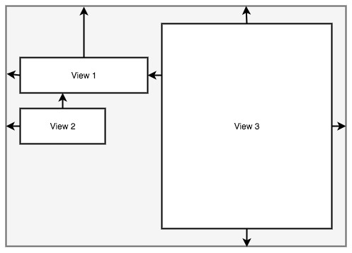
Consider, for example, the layout illustrated in Figure 25-12 below:
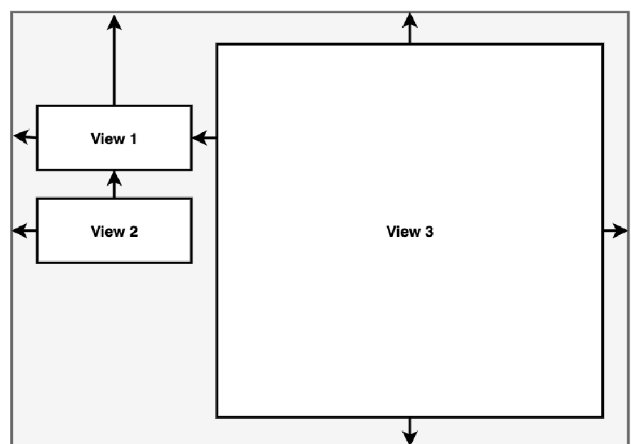
The key points to note about the above layout are that the width of View 3 is set to match constraint mode, and the left-hand edge of the view is connected to the right-hand edge of View 1. As currently implemented, an increase in width of View 1 will have the desired effect of reducing the width of View 3:
A problem arises, however, if View 2 increases in width instead of View 1:
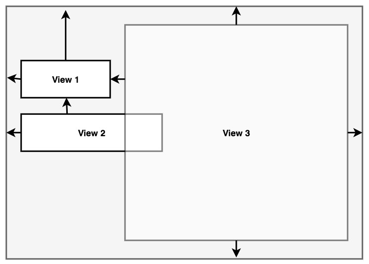
Because View 3 is only constrained by View 1, it does not resize to accommodate the increase in width of View 2, causing the views to overlap.
|
You are reading a sample chapter from Android Studio Giraffe Essentials – Kotlin Edition.
Buy the full book now in eBook (PDF) or Print format. The full book contains 94 chapters and over 830 pages of in-depth information. |
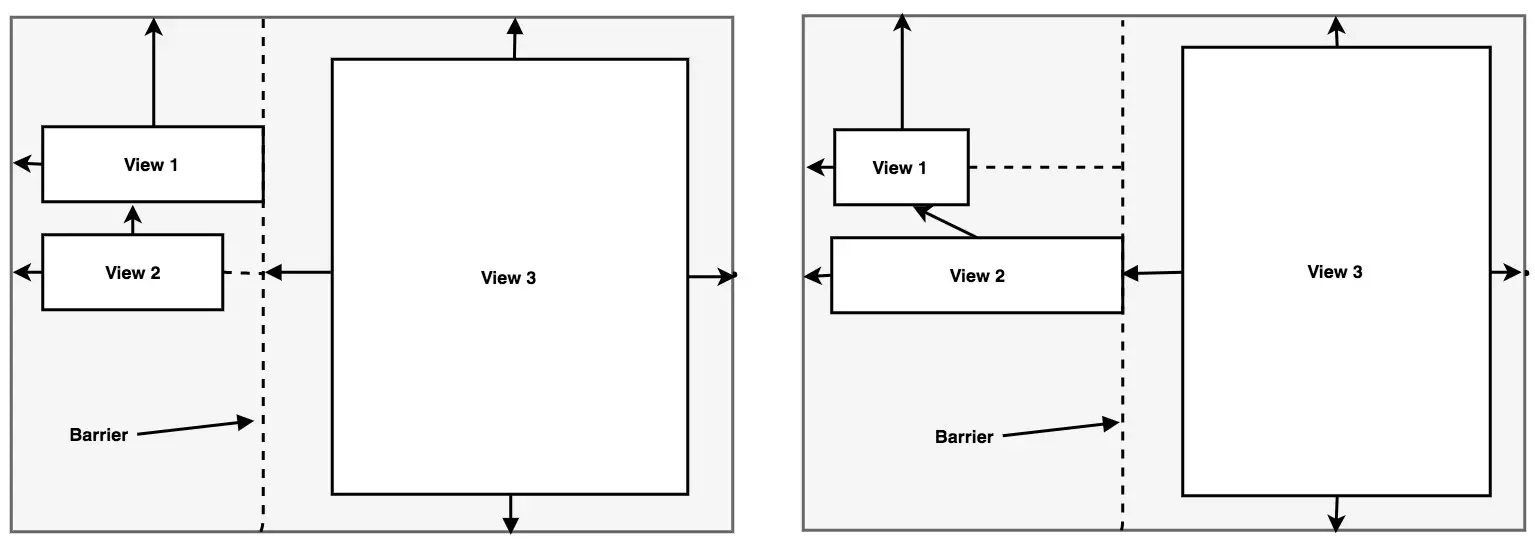
A solution to this problem is to add a vertical barrier and assign Views 1 and 2 as the barrier’s reference views so that they control the barrier position. The left-hand edge of View 3 will then be constrained relative to the barrier, making it a constrained view.
Now when either View 1 or View 2 increases in width, the barrier will move to accommodate the widest of the two views, causing the width of View 3 to change relative to the new barrier position:
When working with barriers, there is no limit to the number of reference and constrained views that can be associated with a single barrier.
Flow Helper
The ConstraintLayout Flow helper allows groups of views to be displayed in a flowing grid-style layout. As with the Group helper, Flow contains references to the views it is responsible for positioning and provides various configuration options, including vertical and horizontal orientations, wrapping behavior (including the maximum number of widgets before wrapping), spacing, and alignment properties. Chain behavior may also be applied to a Flow layout, including spread, spread inside, and packed options.
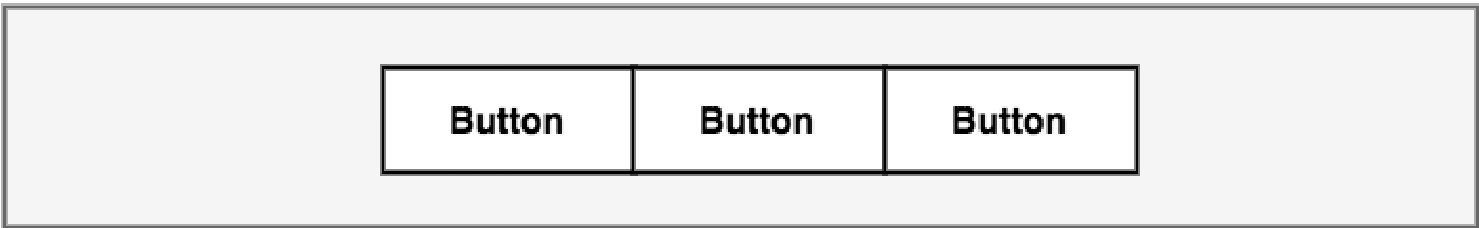
Figure 25-16 represents the layout of five uniformly sized buttons positioned using a Flow helper instance in horizontal mode with no wrap settings:
|
You are reading a sample chapter from Android Studio Giraffe Essentials – Kotlin Edition.
Buy the full book now in eBook (PDF) or Print format. The full book contains 94 chapters and over 830 pages of in-depth information. |
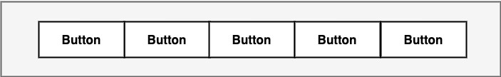
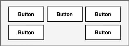
Figure 25-17 shows the same buttons in a horizontal flow configuration with wrapping set to occur after every third widget:
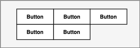
Figure 25-18, on the other hand, shows the buttons with wrapping set to chain mode using spread inside (the effects of which are only visible on the second row since the first row is full). The configuration also has the gap attribute set to add spacing between buttons:
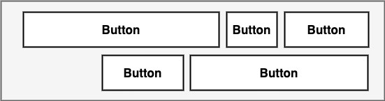
As a final demonstration of the flexibility of the Flow helper, Figure 25-19 shows five buttons of varying sizes configured in horizontal, packed chain mode with wrapping after each third widget. In addition, the grid content has been right-aligned by setting a horizontal-bias value of 1.0 (a value of 0.0 would cause left-alignment while 0.5 would center-align the grid content):
Ratios
The dimensions of a widget may be defined using ratio settings. A widget could, for example, be constrained using a ratio setting such that, regardless of any resizing behavior, the width is always twice the height dimension.
ConstraintLayout Advantages
ConstraintLayout provides a level of flexibility that allows many of the features of older layouts to be achieved with a single layout instance where it would previously have been necessary to nest multiple layouts. This can avoid the problems inherent in layout nesting by allowing so-called “flat” or “shallow” layout hierarchies to be designed, leading both to less complex layouts and improved user interface rendering performance at runtime. ConstraintLayout was also implemented to address the wide range of Android device screen sizes available today. The flexibility of ConstraintLayout makes it easier for user interfaces to be designed that respond and adapt to the device on which the app is running.
|
You are reading a sample chapter from Android Studio Giraffe Essentials – Kotlin Edition.
Buy the full book now in eBook (PDF) or Print format. The full book contains 94 chapters and over 830 pages of in-depth information. |
Finally, as will be demonstrated in the chapter entitled Using ConstraintLayout in Android Studio, the Android Studio Layout Editor tool has been enhanced specifically for ConstraintLayout-based user interface design.
ConstraintLayout Availability
Although introduced with Android 7, ConstraintLayout is provided as a separate support library from the main Android SDK and is compatible with older Android versions as far back as API Level 9 (Gingerbread). This allows apps that use this layout to run on devices running much older versions of Android.
Summary
ConstraintLayout is a layout manager introduced with Android 7. It is designed to ease the creation of flexible layouts that adapt to the size and orientation of the many Android devices on the market. ConstraintLayout uses constraints to control the alignment and positioning of widgets relative to the parent ConstraintLayout instance, guidelines, barriers, and the other widgets in the layout. ConstraintLayout is the default layout for newly created Android Studio projects and is recommended when designing user interface layouts. This simple yet flexible approach to layout management allows complex and responsive user interfaces to be easily implemented.